3 Tips to Increase Web Accessibility for Interactive Demos

Head of Customer Success
Over the past decade, there’s been a huge emphasis on web accessibility, making it easier for people with disabilities to consume and interact with online content.
The World Wide Web Consortium (W3C), for example, has developed Web Content Accessibility Guidelines (WCAG) — shared technical standards that make websites, apps, and other digital assets accessible to people with a wide range of disabilities. It is important to note that there are three levels of WCAG - A, AA, and AAA with as AAA the highest level of conformance.
The European Accessibility Act (EAA) will also become a national law in all 27 European Union (EU) member states in June 2025.
At Navattic, we’ve prioritized features that make interactive demo software more accessible. Below, we share why demos have an edge over other content like videos and how to make your demos more accessible.
But first, let’s take a step back and define web accessibility.
What is web accessibility?
Website accessibility is the practice of designing and developing websites so that people with disabilities can perceive, understand, navigate, and contribute to the Web.
Some examples of basic web accessibility criteria include:
- Alt text on images, so that non-sighted or low-vision visitors can understand what’s being shown
- Tab-enabled navigation, for people who don’t use a mouse
- Color contrast, so that people with visual impairments can still read and distinguish text from other parts of a website
- Proper heading structure and clear copy, so that visitors who use screen readers can easily navigate the site and understand what’s written on the page
- Form fill extensions, for people who need more time to fill them out
See a full list of what criteria are included in Level A, AA, and AAA.
Why use an interactive demo over a video for accessibility?
There are a couple of reasons to opt for interactive demos over videos when it comes to web accessibility.
1. They support screen readers
People who have trouble seeing and interacting with digital content typically use screen readers, technology that reads website text aloud or converts it to braille.
And, according to Web Content Accessibility Guidelines, “all web pages must use proper heading level structure so users with screen readers can easily navigate the site.”
Unlike interactive demos, stylized product videos or animations without captions don’t have text, so screen readers can’t dictate it.
2. They limit distractions
Videos also have much more motion than interactive demos. For people with low vision, this can make it difficult to know what elements to concentrate on. And particularly fast-moving objects or flashing lights can also trigger people with chronic migraines or epilepsy.
Interactive demos remove those distractions and tell a clear step by step story.
3 Steps for interactive demos accessibility
Below, we run through three straightforward ways to make your interactive demos more accessible:
- Update your interactive demo theme
- Use screen reader capabilities and Aria descriptions
- Improve demo navigation with forward and back buttons
1. Update colors, focus rings, and fonts
Colors
First, use a free checker (like this one) to confirm that the color scheme you’re using in your demo meets web accessibility standards. Be sure to check the contrast for:
- Font color (foreground) vs. background dialog color (background)
- Font color (foreground) vs. button color (background)
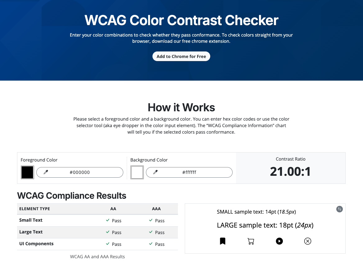
Customers often unknowingly pick color themes that straddle the line between pass and fail. With a checker like this, you can keep tweaking your colors to get more accessible shades.
Focus rings
Next, head to the “Accessibility” section of Navattic Themes to add a high-contrast focus ring.
Focus rings highlight text, next and back buttons, and action actions, helping users navigate through your demo.
In this screenshot, the focus ring is the navy box around the “Welcome to Navattic!” text:

To comply with WCAG requirements, we recommend a focus ring at least 2px thick.
Fonts
Finally, double-check your font. Arial, Verdana, Times New Roman, and Helvetica are some common examples of more accessible fonts.
But Google has quite a few other font recommendations, like this Inclusive Sans Google-approved font, that you can upload to Navattic:
- Head to Themes
- Choose Fonts
- Upload your custom font
Navattic’s customization tools will accept Google files or custom font URLs.
2. Consider screen reader capabilities
Use a screen reader yourself
Screen readers can automatically read the content in Navattic dialog boxes (Modals and Tooltips), but your experience may differ from that of someone with a disability.
For example, you may show a feature in the demo, but going through the demo yourself with a free screen reader (like this one) may help you realize that you need to better explain it.
There are also translator tools that you can use to make sure your demo is clear for individuals who have English as a Second Language.
Use Aria Descriptions
Be sure to also toggle on Aria Description for Tooltips and Modals.
Adding these descriptions will help screen readers explain the interactive content in your demo.
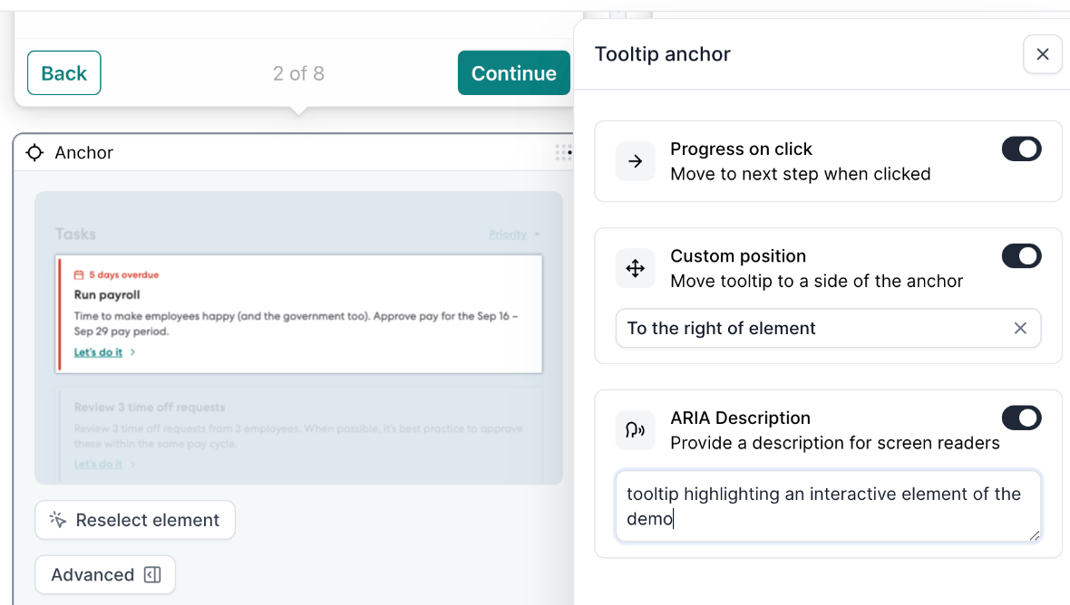
You can add Aria Descriptions by clicking the “Advanced” option on the bottom left of your Modal or Tootip → toggling on ARIA Description → typing in the appropriate text.
3. Improve navigation
Interactive demos help visitors navigate in various ways: clicking, swiping, and using keyboard keys — functionality that videos, GIFs, and other common website assets don’t support.
Here’s how to make sure everyone gets the best possible experience, whether they are:
On desktop
Enable Navigation Buttons in your Flow Settings. That way, demo visitors can use the Tab keyboard key to:
1. Select different areas of the demo to read.
2. Progress forward in the demo.
On mobile
Consider enabling “auto progress” in your mobile swipe view. This automatically advances to the next step without the demo visitor needing to swipe or tap on the screen.
You should also customize your Mobile Theme to be high-contrast:
1. Go to Themes.
2. Head to the Mobile Swipe section.
3. Choose a high-contrast Background color.
Consider activating the CTA button on all mobile swipe screens so that it’s very large and makes it clear what you’re asking users to do next.
Keep in mind that some people use screen readers on their phones, so you may want to test your mobile demo with screen readers as well.
To keep an eye on our latest accessibility features, head to the Product Updates area of our help docs.
And for more tips to improve your interactive demos, check out: