Our 11 Top Interactive Demo Suggestions (And How to Use In-App Demo Suggestions)

Head of Growth & Product Marketing
In analyzing over 28,000 demos built on our platform, we identified a few things the top 1% of demos do differently. And we wanted to help every customer easily apply best practices to their demos.
So we built in-app demo suggestions, automated alerts that pop up whenever any of your demos could use some tweaks.
These suggestions are optional — at the end of the day, you have total control over your demos’ look and feel.
For extra granularity, you can toggle on specific tips that apply most to your use case, like this:
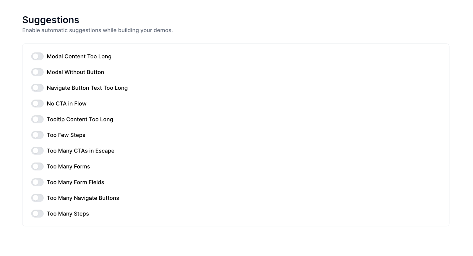
11 Top Demo Suggestions
Below, we’re breaking down each category of demo suggestions and explaining why they matter — with stats from our State of the Interactive Product Demo and input from top customer interviews to back our theories up.
Step Content-Length
Corresponding Suggestions: Modal Content Too Long, Tooltip Content Too Long
First up is content length. Modals that are too lengthy can cause users to just skim over that step or give up on the demo altogether. Tooltips with a lot of text can also discourage engagement, overwhelming users with too much information.
According to our State of the Interactive Product Demo, most top-performing interactive demos use between 100 -199 characters in their dialog boxes.
And, anecdotally, our customers echo the same sentiment: shorter is better.
Pulkit Sachdeva at Chainstack advises, “Stick to the golden mantra: as long as it needs to be, as short as it can be. Every word counts.”
Maria Castaneda at Lokalise explains how keeping demos concise is a more effective way to convey your product’s value.
“Keep it short, engaging, and follow a happy path for easier customer engagement. Sometimes it's more effective to show rather than tell, especially with our product directly available for demonstration.”
Brittany Wolfe at Lokalise shared that, like most people, she’s guilty of clicking next when confronted with walls of lengthy text. So instead, she keeps demo content basic and straightforward, improving the chances that users really take in the knowledge that’s being conveyed.
“If you just want people to see the aha moment or kind of have a generic understanding of what to do, keep the text really basic.”
CTAs + Navigate Buttons
Suggestions: Modal Without Button, Navigate Button Text Too Long, No CTA in Flow, Too Many CTAs in Escape, Too Many Navigate Buttons
Next comes a focus on calls to action and general demo navigation. Short, snappy demos with a clear flow and one or two compelling CTAs seem to be the sweet spot.
Our research found that, on average, our top customers use 1.6 CTAs in their demos.
They usually insert these CTAs around step 11 or step 15.
Depending on how long your demos are, these positions usually conclude the product tour, which makes sense — the end is likely the best place to put a CTA.
In her customer interview, Trupti Wadadekar at Pushpay emphasized just how important CTA placement is:
“Using CTAs in the right place is very important. While some product tours can be extensive, especially those covering the entire product, I aim to keep mine within 8 to 12 clicks at most.”
Most Navattic customers use CTAs in the demos to drive users further down the funnel, like booking a live demo or going through additional tours.
Almost 29% use “Book a Demo.” “Free Trial” and “Additional Tours” followed closely, with 20.4% and 14.8% using those CTAs, respectively.
The CTA leading to the interactive demo can also be an important way to drive engagement. For example, incorporating user expectations of how long the demo will be.
Pulkit explains, “If your demo CTA conveys, ‘This will take less than five clicks,’ or ‘You can complete this in under two minutes’ it significantly reduces the cognitive load for users.”
Before you launch, always go through the demo yourself to catch any missing Modal buttons, awkwardly long button names, or opportunities to add or remove a CTA.
Wayne Dakin at Dropbox reminds us, “Use the preview feature to walk through your demo. It’s common to spot things you missed or want to adjust during this review. With Navattic, you can easily add or adjust elements like modal windows beacon, or buttons.”
Step Count
Suggestions: Too Few Steps, Too Many Steps
We get asked all the time how long demos should be. In general, top-performing interactive demos tend to have between 8 to 15 steps. Very few have above 25.
Over half of the top demos fell into the 10 to 19-step range. Nearly 30% were 9 steps or less.
The length of your demo will really depend on what you want your end user to get out of them. If they’re purely educational — say, maybe your demo is for existing customers who want to implement one of your key integrations — they may be a bit longer.
If you’re trying to convert hot leads to booked sales calls, you may want to keep demos shorter to hook them in and make them want to see more.
The key is to make your demos as valuable as possible for the audience you’re trying to reach. As
Alexander Yant at Slope puts it, “Aim to make your demos concise and impactful, showing only the most relevant and engaging parts of our platform.”
Vivian Chau at Envoy agrees, “It's a constant balance between being concise and showing detailed examples with demos. Help your customers understand how they can see themselves getting value from your product.”
Navattic’s checklist feature is a good way to organize your demo, and serves as a forcing function, making you decide what the most important parts are to show. Trupti explains:
“I find Navattic's checklist feature invaluable. It allows me to break down the tour into smaller, more relevant modules for specific product areas, ideally capped at 10 to 12 clicks per module, followed by a strategic CTA guiding the audience's next steps.”
Forms
Suggestions: Too Many Forms, Too Many Form Fields
Another common question we get is whether to gate or ungate interactive demos.
According to our data, close to 71% of top-performing demos do not gate. So if you can avoid gating, we suggest leaving your tour ungated.
Ungating gets more eyeballs on your product and helps you better qualify and educate prospects before they talk to your sales team.
Federica Felicetti at Sibill says leaving her demos ungated actually boosts free trial sign-ups:
“Allowing prospects to view the demo without any barriers resulted in more sign-ups for the free trial compared to those who had already provided their email but didn’t proceed further in the funnel.”
If you do need to gate, we recommend keeping it to one form and minimizing the number of form fields to not scare off users.
We also suggest placing your form after step 5, so the first thing the user sees isn’t a gate. That way they’re already hooked and more likely to enter in their information to keep going.
Forms placed later in the demo had about a 10% higher engagement rate.
Want to learn more about our demo suggestions and how to customize them in your workspace? Read our product announcement or reach out to your CSM for a more in-depth walk-through.