2024 Industry Benchmarks + Examples for Interactive Demos

Head of Growth & Product Marketing
As we examined the data we collected for the 2024 State of the Interactive Product Demo report, several patterns emerged.
One was the number of power users in specific SaaS industries.
Since we’ve had a few customers ask for stats by specific use case, we’re breaking down our data by the top ten most common industries and showcasing excellent interactive demo examples for each.
Industry Benchmarks for Interactive Demos
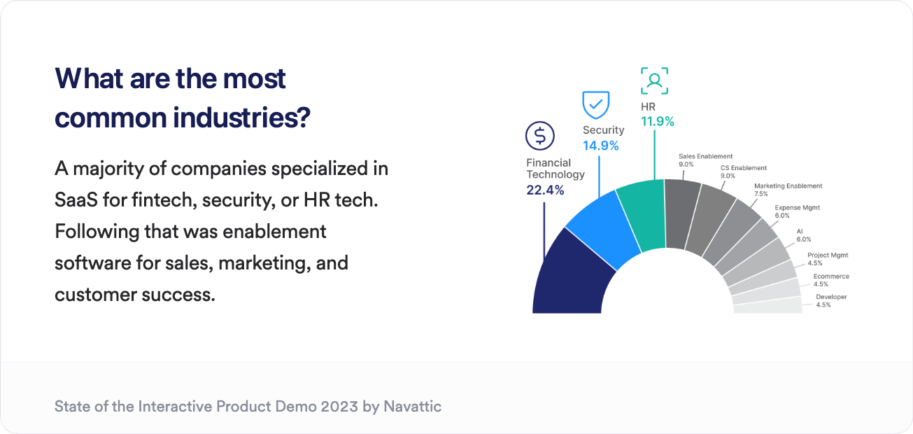
As you can see in the chart below, fintech, security, and HR tech lead the way in interactive demo usage. But sales enablement, CS enablement, and martech follow close behind.
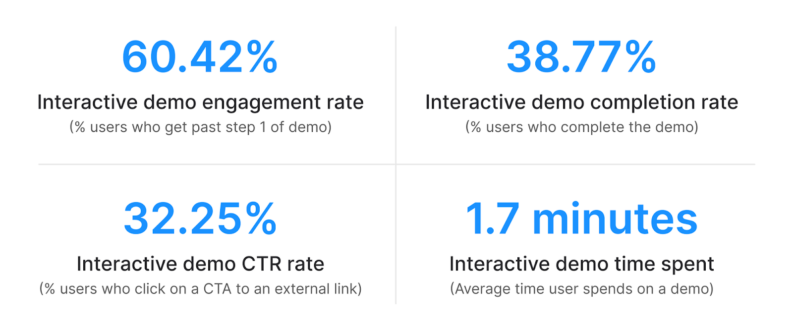
The top 1% of our customer interactive demos had 60.42% of users getting past step 1 of the demo. Nearly 40% continued on to complete the full demo, and 32.25% clicked on a CTA.
For a deeper look at interactive demo KPIs, we put together a chart showing these metrics by industry — all of which land far above standard SaaS rates.
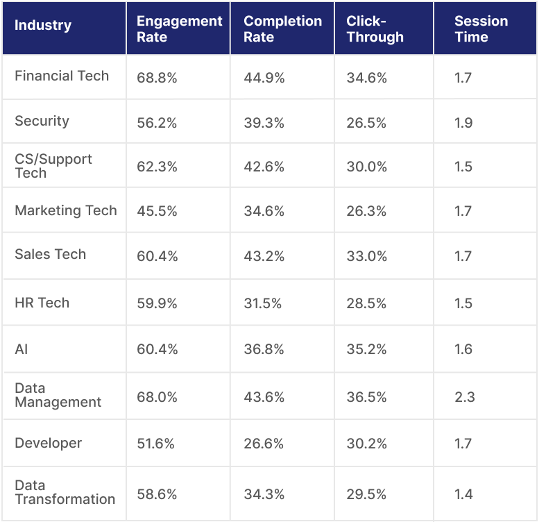
Dividing these stats up by industry, we found:
More complex products had longer session times. This could indicate that security or data management industries have longer, more in-depth demos.
Fintech and data management have the highest engagement rates (68.8% and 68%, respectively). For both categories, it’s tough to show the product's value without advanced setup and integration, and the end user's success relies on an easy-to-use UI. Interactive demos make both of these characteristics easy to highlight.
Industry-specific examples
To give you a sense of what top industry demos look like, we’re providing examples in each category below.
Keep reading to find out where companies have placed each demo, how long they are, and other unique features to consider as you build your interactive demos.
Financial Tech
Ramp, an accounting automation software, uses an interactive demo to show the product’s value straight from the website without requiring users to go through a full onboarding process.
When the demo opens in full-screen, users input their email to access the demo (which Ramp uses to send follow-up emails later).
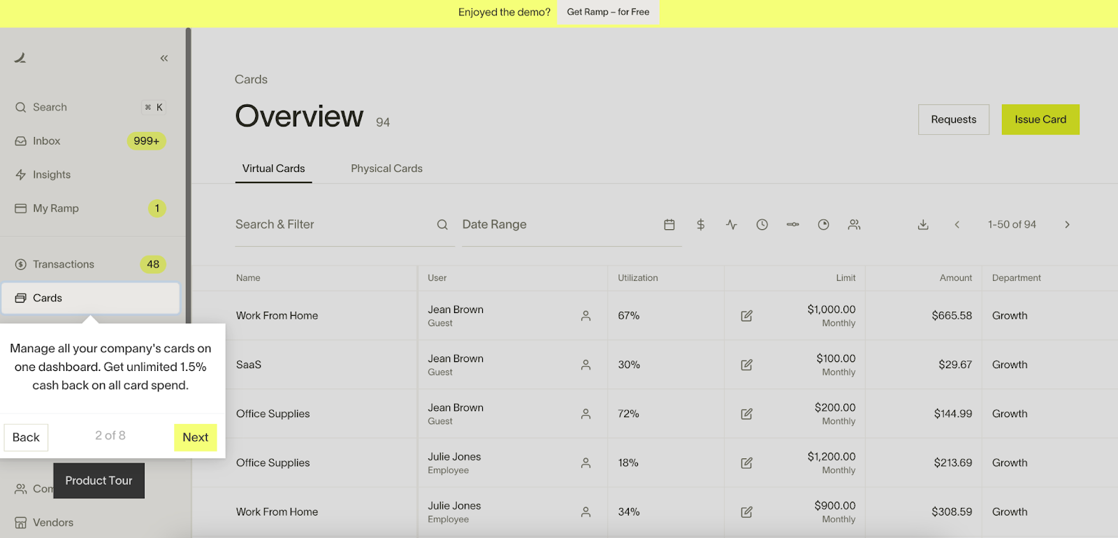
The demo is a quick 8 steps, giving users a high-level overview of the product’s main features.
On almost every step, the Ramp team includes some sort of proof point, like “On average, companies save 27% on contracts that Ramp negotiates,” or “On Ramp, the average company goes from closing books in 3 weeks to just over 1 hour” to reinforce product value.
At any time, users can click the “Get Ramp — for free” button to sign up for a chat with a Ramp expert. And after they hit the 8th step, they’re asked to choose whether to continue the tour or get started with Ramp.
According to Ramp’s marketing team, the Navattic tour is “responsible for 15% of the leads coming from our website.”
Xepelin, an accounts receivable software company, also uses interactive demos on its website. They put an interactive demo just below the fold on each product page.
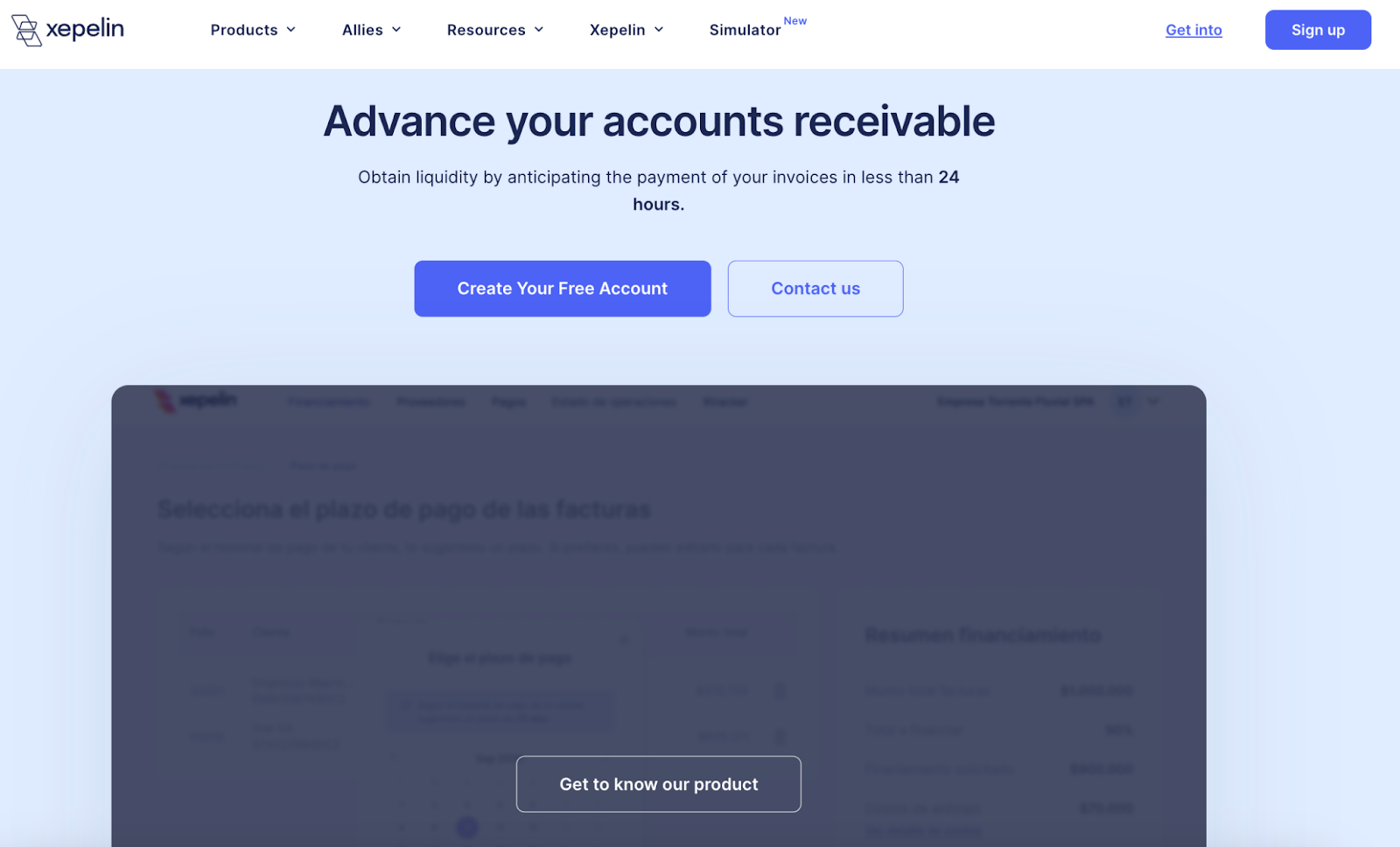
Upon clicking “Get to know our product,” the tab refreshes and opens an interactive demo.
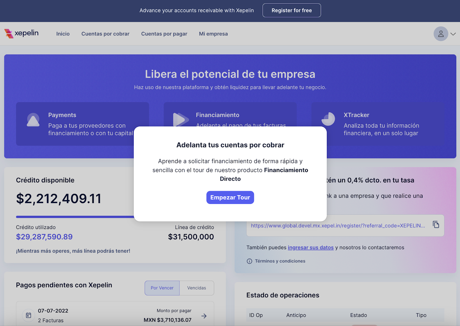
Because its audience is primarily Latin American, the tour is all in Spanish, running users through all the critical elements of the platform so they can envision using it at their organization.
Security
Axonius, “a system of record for all digital infrastructure,” uses a demo center to showcase its collection of various demos.
This approach gives users optionality, critical for Axonius’s audience — security admins with a wide range of use cases.
Within the demo center, they can learn about anything from cybersecurity asset management to cloud asset compliance to vulnerability management.

When users click “See More,” they go to a use case sub-page with an interactive demo to walk them through a specific part of the Axonius product.
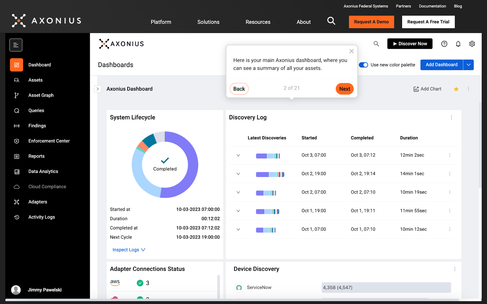
As we mentioned above, security platforms tend to have longer demos, and Axonius is no exception. Theirs have roughly 20 steps, giving users a full picture of all that their product can do.
Citrix, another security platform, uses Navattic to show off its App Delivery and Security service. Like Axonius’s demo, its tour is above the fold, encouraging users to get their hands on the product and gain a fully-featured experience without getting in touch with sales.
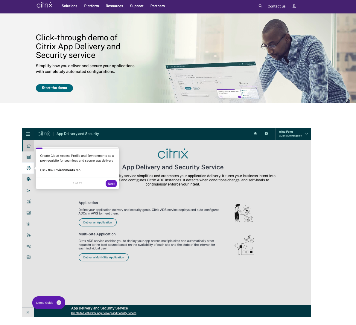
The Citrix demo is thorough. Its 13 steps ensure users know what App Delivery and Security is capable of, how it can save time, and how it protects an organization with automated app configuration.
CS/Support
Gorgias, customer service software for e-commerce companies, has a permanent spot for its product tour in the navigation bar.

Featuring the “Product tour” button so prominently increases the chances that users will explore the tour, seeing what features Gorgias has to offer.
When the tour opens up, Gorgias asks for users’ email addresses.
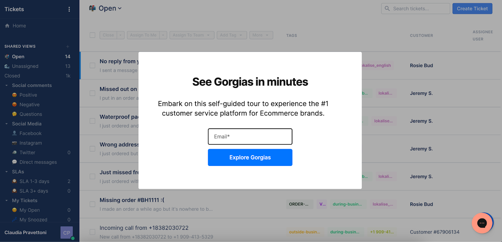
With this information, they can send additional educational materials, including other interactive demos they’ve tailored to users’ interests, pushing them further toward conversion.
Marketing Tech
Crossbeam, a partner overlap tool, places its interactive demo below the fold on its core product’s feature page.
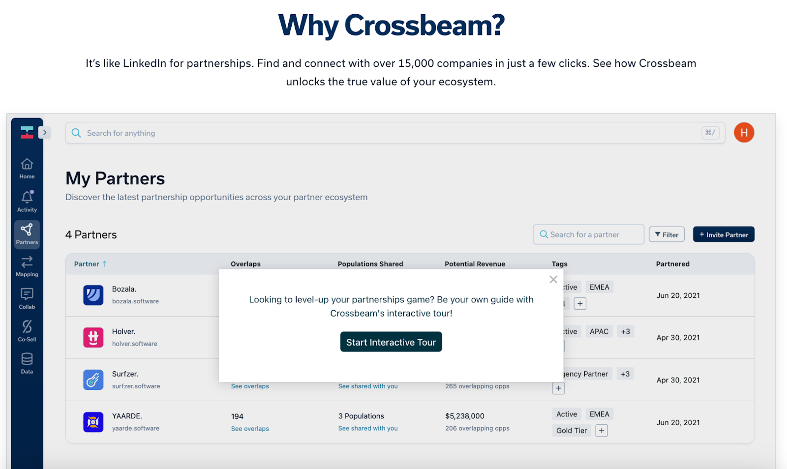
The tour first acquaints you with the Crossbeam platform and then dives into several of the most common use cases for the Core Crossbeam experience.
The team at Crossbeam tells us, “It helps that we can build interactive demos faster than other assets. Recording a video could easily take twice as long and end up not nearly as polished as a Navattic demo.”
At the end of the tour, Crossbeam invites users to sign up for a free trial to continue building on their knowledge and ultimately convert them into paying customers.
Drift, conversational AI software, created multiple demos to educate users on each aspect of its platform and put them into a demo center.
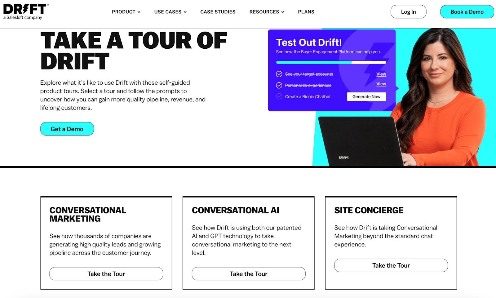
Users can visualize how Drift’s chatbots can assist with lead generation, personalization — and even tracking site visitor intent.
After the first few steps of a tour, Drift asks for user emails.
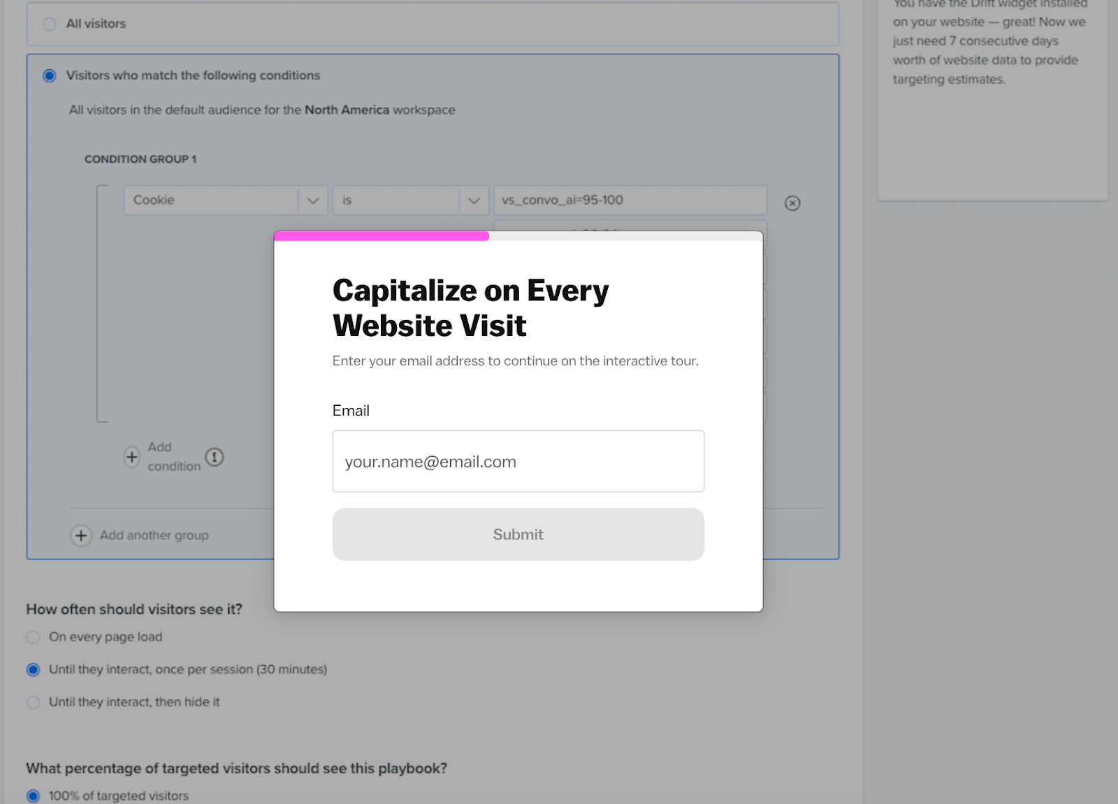
If users make it this far, Drift knows they are at least interested in the product and should flow into a nurture campaign.
Sales Tech
Dooly, a sales enablement platform, inserts interactive demos on their product overview page, which is easily accessible from the navigation bar:
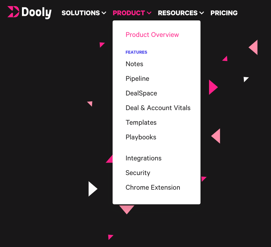
As users scroll down the overview page, they see a brief description of each Dooly product — DealSpace, Smart Notes, Pipeline, and Enablement — accompanied by an interactive tour.
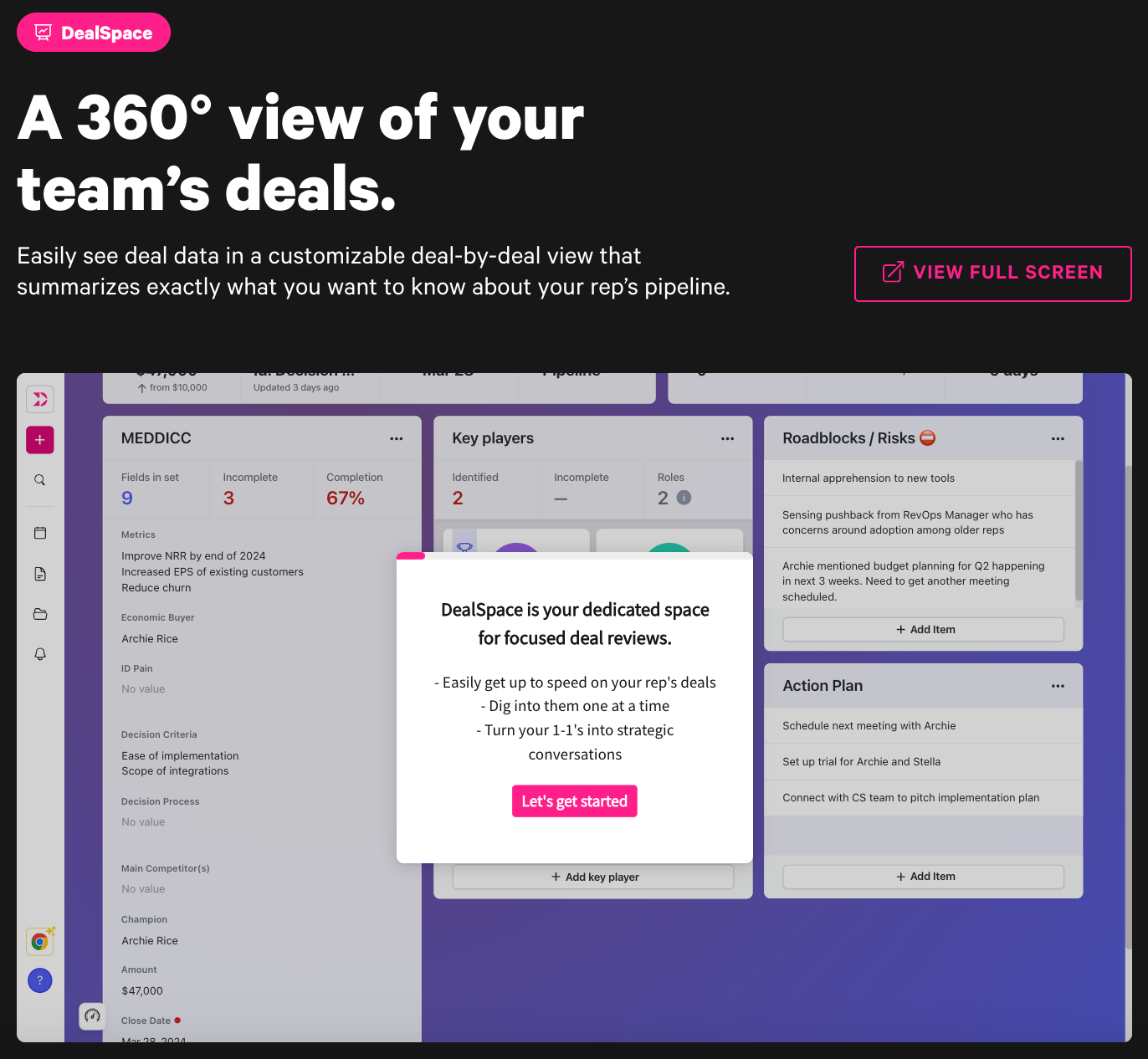
The demos start by letting users know the main things the product does and what will be shown in the demo. This helps users self-serve, knowing they’ll get the information they want and need.
At the end of the tour, users can schedule a customized walk-through with a sales rep or continue exploring other Dooly demos at their own pace.
Per Dooly’s team, “Receiving a demo on a feature you were most interested in feels more personalized than just an email or one-pager, and is just as scalable for our team to share. Navattic’s new demo personalization ability makes this even easier.”
HR Tech
Remote, a global HR tool, publicizes its interactive demo on each product page right next to the customary “Book a demo” CTA.
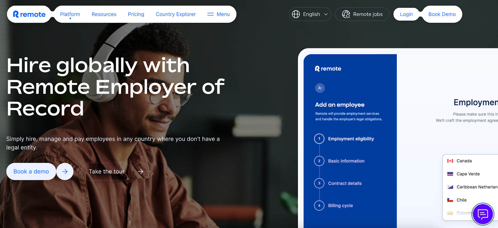
Clicking “Take the tour” jumps the user down the page to the self-guided tour.
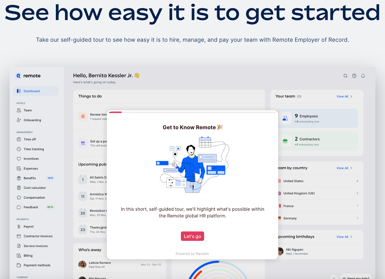
12 steps later, users know how Remote can help HR managers view, calculate, and update key hiring information for employees and contractors, no matter where they work.
Their website isn’t the only place they use interactive demos. Rodney Rasmussen, Senior Product Marketing Manager at Remote, told Navattic:
“Our demos are performing really well. We're seeing significant engagement because we've made them easily accessible — embeddable on our website, linkable from emails, and even within the product itself.”
Guru, an AI-powered enterprise search, intranet, and wiki, uses an interactive demo as one of its 3 calls-to-action on its homepage:
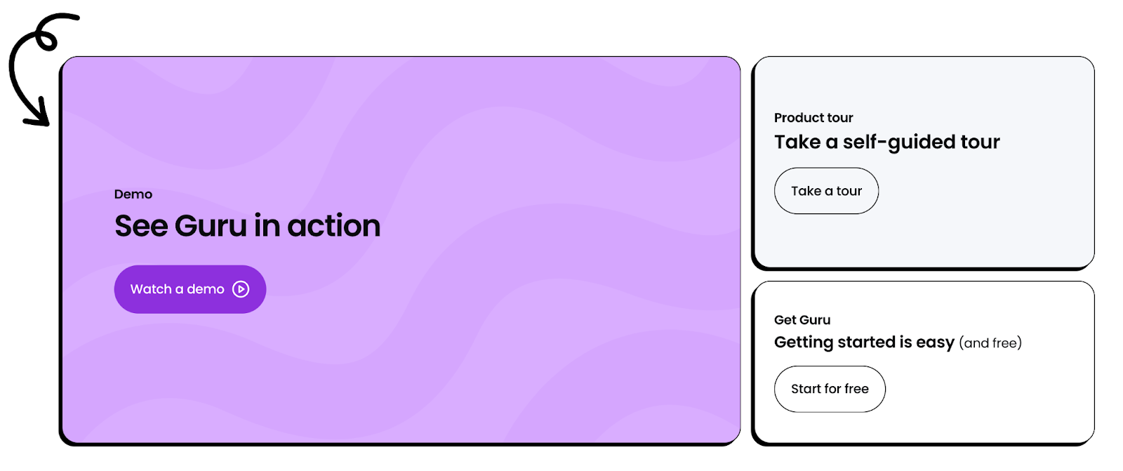
The tour opens in full-screen, with fun colors and branding to keep users engaged. Every tour step is highly stylized to show what each feature is and how it works.
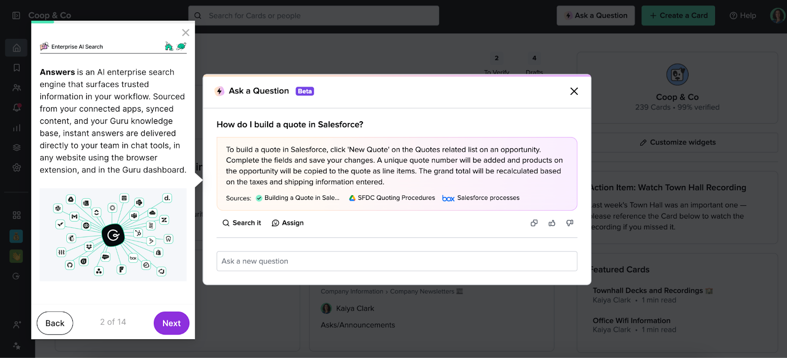
Some steps even have background gifs to show the product in action while you read. Others take you out of Guru and into other apps it's connected to, like Gmail and Slack.
These small touches help prospective customers see how it could improve employee workflows.
AI
Neuroflash, Europe's “number one AI text & image generator,” entices users to take a tour of their product straight from the nav bar at the top of their website.
When users click on “Tour,” the browser refreshes, and the Neuroflash tour is displayed.
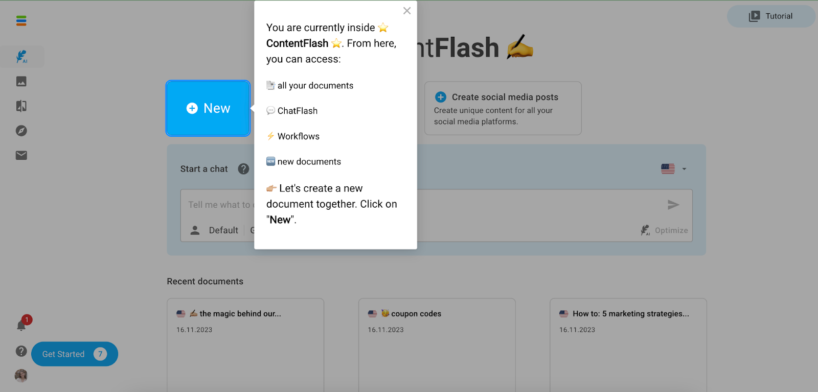
Neuroflash’s team keeps users engaged with emojis, underlined or bolded suggestions, and hints at the bottom of each step.
Some steps link out to resources or the Neuroflash Help Center, ensuring users have all the information they need to make an informed buying decision.
Lokalise, a continuous localization and translation management platform, takes the nav bar route as well:

Upon clicking the “Product tour” button, a new tab opens where a demo shows users how Lokalise translates their product, marketing content, and website into various languages.
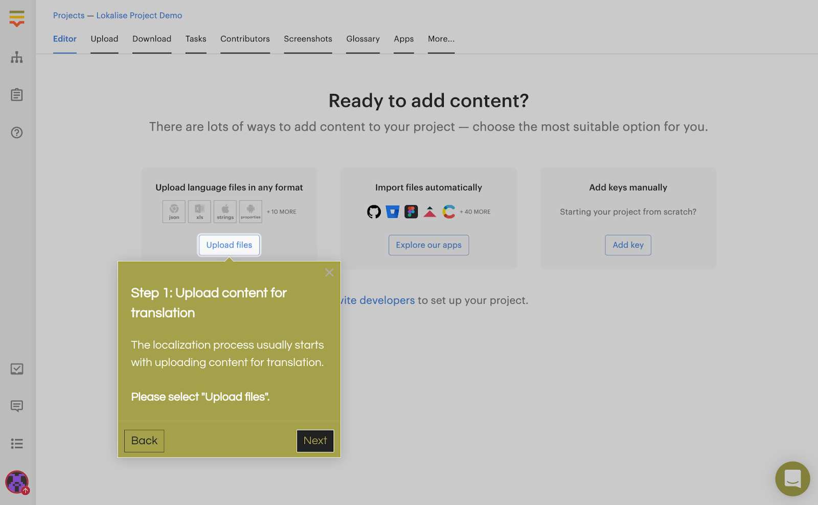
The tour is short; it only takes 2 minutes. But once users finish, they’re taken to an extended tour that shows off more functionality in 19 steps.
Maria Castañeda, Senior Product Marketing Manager at Lokalise, shared, “Navattic has been making it much easier for leads to check out use cases of the feature. Before the interactive demos, we were having trouble getting prospects to perform the action to get to the aha moment.”
Data Management
Nutshell, a user-friendly CRM and email marketing tool, embeds its interactive demo to give site visitors an “inside look” at the product:
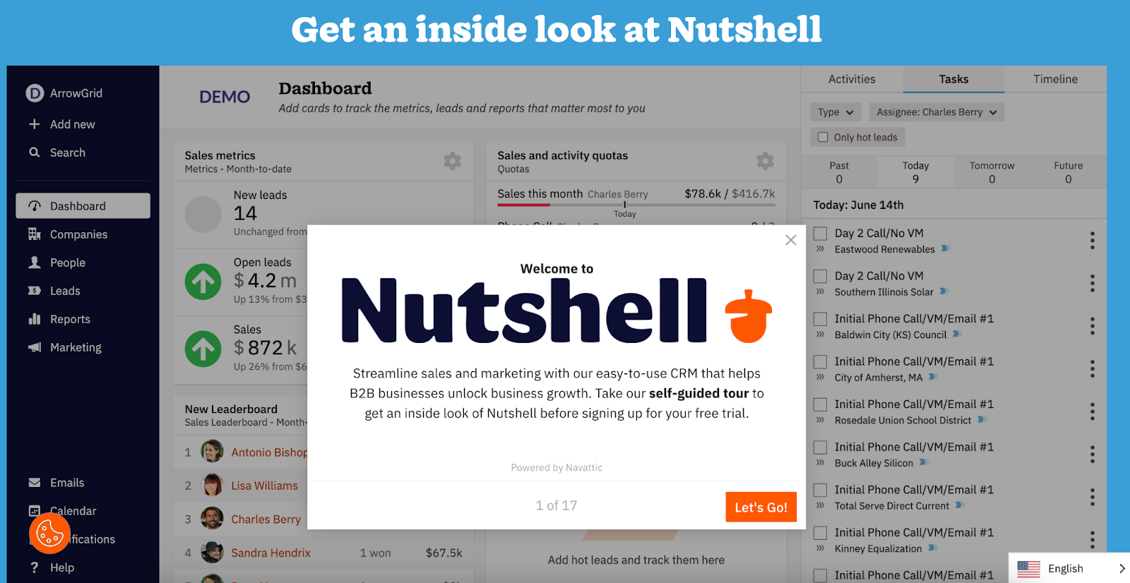
The demo points prospects to various parts of the platform, prompting them to click buttons and filters as if they were using Nutshell in real life.
Roughly 10 steps in, users can start a free trial, keep exploring the demo, or join Nutshell’s next live tour.
Rally, a user research CRM, has made its demo center a core section of its website's resources.

Clicking “Learn more” takes users to a page with an intro demo and 6 other scheduling, recruitment, and incentives demos.
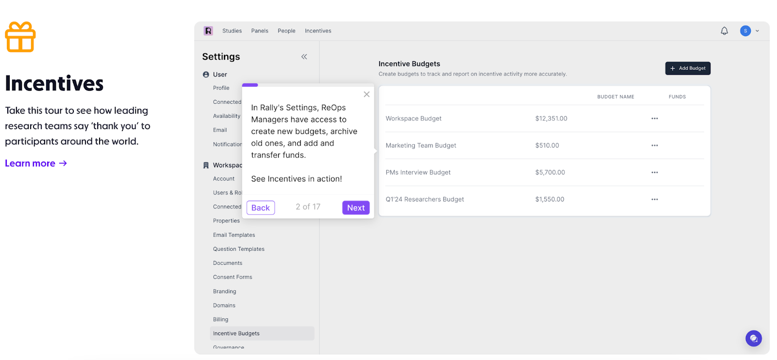
Each demo is longer than traditional tours, anywhere from 13 to 24 steps, giving users a deeper understanding of Rally’s best features.
Developer
Because Jellyfish, a cloud-based engineering management platform, has a wide audience and a fairly robust product, its marketing team decided to build dozens of demos catering to different personas.
Each persona page on their website has a short blurb explaining the value of Jellyfish for a specific team (engineering, product ops, finance, etc.) and an interactive demo showing that value in action.
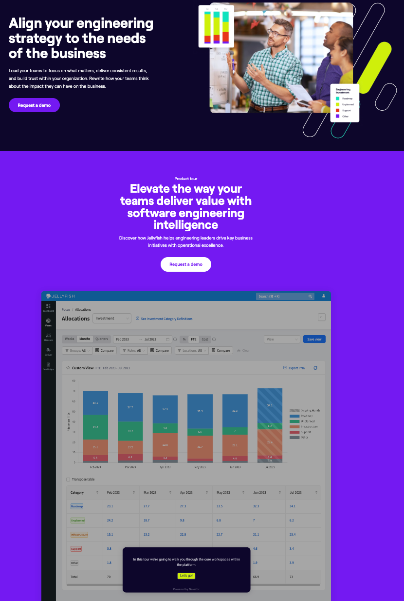
A few steps in, users are asked whether they want to jump to another resource, like a video, or continue with the tour.
Purposeful pauses like these give people several ways to learn and keep them engaged — which is key to getting them over the hump of talking to sales.
The Jellyfish team explains, “From a pipeline perspective, the new product tours have generated over $600k in pipeline over the last six months.”
DigitalOcean, cloud infrastructure for developers, has multiple tours as well. These correspond to various use cases — deploying code, creating virtual machines, and building Kubernetes clusters.
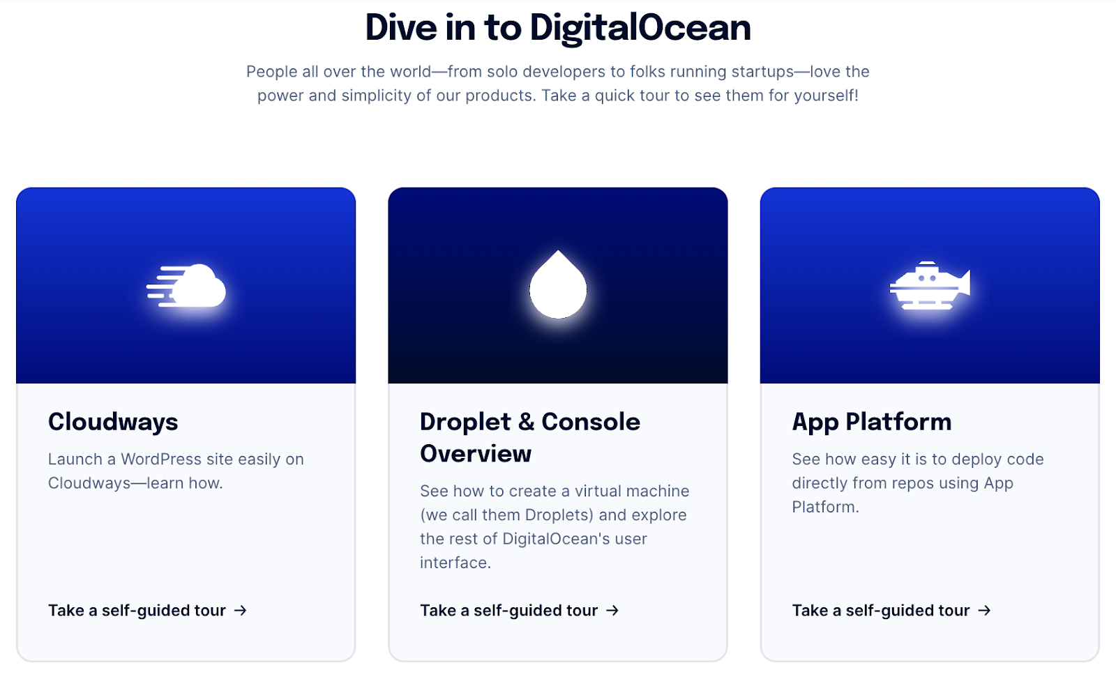
Like some of our other top customers, DigitalOcean collated these demos in a demo center, which they market on their homepage:

At the end of the demos, DigitalOcean urges users to act — whether it’s signing up for a free trial or using their promo to get $100 of hosting credit.
Data Transformation
FiveTran, a cloud-based automated data movement platform, works best when connected to a company’s other apps.
To show prospects how easy it is to set up these integrations, they’ve got roughly a dozen demos in their demo center, highlighting connectors with Salesforce, Jira, Facebook, Zendesk, Shopify, and more.
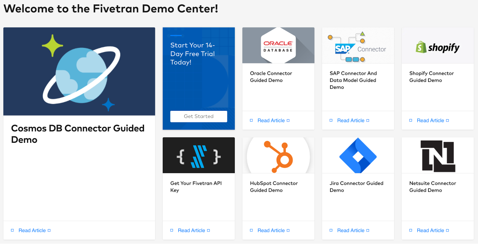
Although Navattic’s GA4 integration allows you to track anonymous interactive demo visitors, FiveTran captures a user’s name, email, and company to send targeted follow-ups right after someone runs through a demo.
And they prompt users to start their 14-day free trial at the end of each demo.
Matillion, which provides cloud-based business intelligence analytics, uses Navattic to simplify its complex product.
Their Data Productivity Cloud is particularly robust, so they encourage prospects to experience their Designer, Data Loader, and Observability features hands-on.
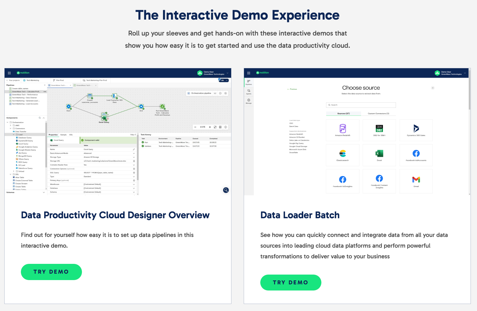
Within the demos, they use convincing copy to emphasize Matillion’s ease of use.
Matillion drives users to convert by gifting 14-day access to all Matillion features with 500 free credits at the end of the demo.
Interactive demos are a game-changer for these ten industries. Yet they have the potential to boost visitor engagement rates, time spent on your blog, and ad click-through rates regardless of the vertical your product serves.
To learn more about how product demos can level up your go-to-market, read: