A/B Testing Examples from Top B2B SaaS Companies

Head of Growth & Product Marketing
A/B testing is especially important for SaaS startups with limited marketing budgets but high-growth expectations. Below, we’re sharing a list of easy, repeatable A/B tests from top-notch SaaS companies as inspiration.
Common A/B tests for SaaS products
Below we outline several types of A/B tests that can help refine and reaffirm your GTM strategy.
Website testing
There are so many aspects of your website that can affect how prospects perceive your brand and product.
The images or icons you choose, the copy you write, the site layout, and navigation all impact a prospect’s decision to schedule a demo or speak with a sales rep.
When A/B testing a website, we recommend testing one aspect at a time. For example, test the color scheme in one experiment and the copy in another. This way you know which part of the website change made the biggest impact.
CTA A/B testing
Often people will include multiple CTAs in their campaigns, but the final one is usually the best one to A/B test since it’s the most critical to get right. Testing variations of common CTAs are:
- “Take a Tour”
- “Request a Demo,”
- “Sign up for a Free Trial”
- “Try ___ out Now”
Remember that you might be using CTAs on your website, in email sequences, and in PPC ads, and all of those channels should be A/B tested.
Email A/B testing
Like a website, many elements of an email can pique a prospect’s interest or shut them down completely.
So subject lines, content, images, and even line spacing are easy to A/B test. Similar to websites we recommend testing one element at a time.
Modifying your best-performing emails and comparing those new versions to the original is a great way to get the ball rolling.
Onboarding A/B tests
Most SaaS companies, particularly product-led ones, publish user guides and welcome emails for new customers.
But it’s hard to gauge what features or messaging will peak a users interest enough to keep them coming back. You can apply onboarding A/B tests to the free trial sign-in process, templates, interactive product experiences, and more.
5 examples of A/B tests run by SaaS companies
To give you some inspiration, we’ve collected five examples of A/B tests run by companies like Hubspot, Unbounce, and FORM. Read on to learn how they designed and conducted A/B tests and their results.
1. Hubspot
A/B Test Type: Email
Results: Although Hubspot hypothesized that in-app notifications would perform better, email prompted more reviews. Only 10.3% of people who opened an in-app notification left a review, while nearly 25% of people who opened an email left a review.
Test Description: SaaS companies are always looking for creative ways to generate positive reviews on sites like TrustRadius, SaaS Genius, Capterra, and G2.
Sending emails to customers is an easy way to request feedback, but Hubspot wasn’t sure if emails would garner better results than in-app notifications.
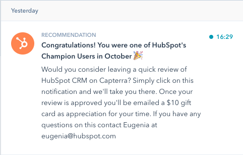
So they decided to test it out, soliciting reviews from half of their top customers via email and the other half through in-app notifications. The messaging in the email and in-app notifications were virtually identical.
This experiment reinforced the need to test assumptions before moving forward with a strategy you think might work.
2. Trainual
A/B Test Type: Website
Results: Trainual saw a +450% lift in free trial signups when the interactive demo was displayed and a +100% increase in users reaching activated trial status seven days after signup. Even better, Trainual had a +175% lift in users converting to paid customers in that same timeframe.
Test Description: Trainual, a business playbook software, needed a way to get users to a lightbulb moment before even starting a free trial, and communicate the value of their product earlier in the evaluation process.
To achieve these goals, they decided to test product tour videos and interactive demos.
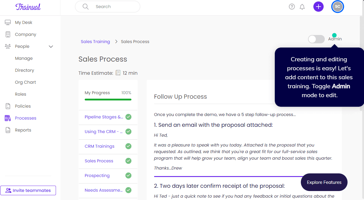
They set up an interactive demo using Navattic, and exposed audiences to the interactive demo and published product videos. Trainual let the test run for a few weeks to gain enough meaningful data for their target KPIs: number of free trial signups and number of highly-engaged users.
3. MonitorQA
A/B Test Type: Onboarding
Results: It turns out that the group that received an interactive demo was much more likely to follow through with their free trial and understand the true value MonitorQA could bring to their business. This had the added benefit of shortening the sales cycle – prospective buyers were more educated on the product and only asked reps questions specific to their use cases.
Test Description: MonitorQA is a mobile inspection software that helps customers conduct audits, automate reporting, and track corrective actions.
While those tasks are inarguably important, they take time to configure, which made it difficult for MonitorQA prospects to get their free trial up and running. Most free trialers would see how complex the product was and decide to abandon their new, free instance altogether.
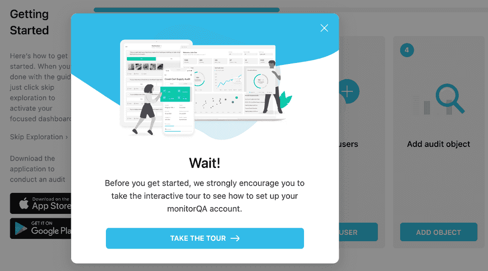
MonitorQA thought that adjusting the onboarding flow might retain more free trial users. So they created an A/B test, where one group of free trial users received the instructions MonitorQA had always sent, and the other got onboarding steps that included an interactive demo.
4. Unbounce
A/B Test Type: CTA
Results: Although Unbounce thought a more unconventional approach to gated content like a Tweet might generate more buzz, it did the opposite. Unbounce found that people were more likely to provide their email addresses and the email landing page had a 24% increase in conversions.
Test Description: Normally, companies offer an exclusive piece of content in exchange for a prospect’s email address, like this:
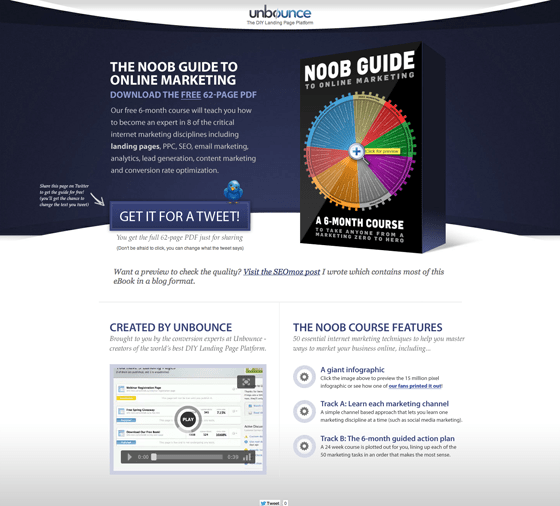
But Unbounce, a landing page builder, wanted to see if they could leverage their landing pages to get free marketing. Rather than just asking for a user’s email address, they requested that prospects Tweet about Unbounce and their Noob Guide to Online Marketing instead.

Half of the time, prospects would land on the traditional email-style landing page, and the other half of the time, prospects would land on the Tweet-style landing page. And on the backend, Unbounce was measuring engagement.
5. FORM
A/B Test Type: CTA
Results: The “Take a Tour” call to action was a clear winner for FORM, decreasing their cost per lead in ABM campaigns by nearly 50%.
Test Description: FORM is a communication, data collection, and task management tool for frontline teams. When analyzing their sales and marketing strategy, they realized that most buyers weren’t ready to request a demo right away; they wanted to experience the product themselves.
Based on that observation, FORM thought prospects may be more likely to click on a CTA like “Take a Tour” rather than “Request a Demo.”
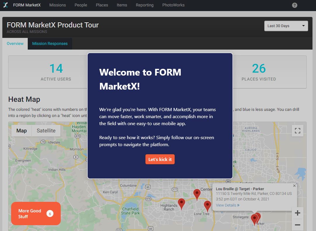
FORM then set up two PPC landing pages to use in their ABM campaigns, one with the “Request a Demo” CTA and one with the “Take a Tour” CTA.
6. Groove
A/B Test Type: Website
Results: Groove had the right idea – the new landing page had over twice the conversion rate as the old page. Whereas the old copy had a 2.3% conversion rate, the new copy yielded a 4.7% conversion rate.
Test Description: Groove, a helpdesk software, was having trouble converting prospects from their landing pages. While their copy was clever and fun, they wondered if more straightforward explanations of what their product does and how it provides value would push more people to convert.
So they got to work understanding why their best customers enjoyed using Groove, what their competitors were doing, and how the tool improved the efficiency of their customer support teams.
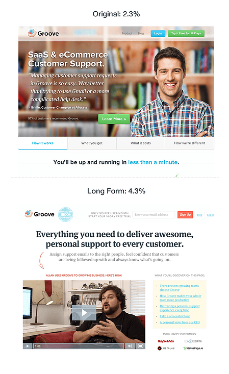
Groove ended up with a longer, more comprehensive landing page explaining exactly how their product would benefit customers and showcased a real customer testimonial.
To see whether this copy would prompt more conversions, they conducted an A/B test, sharing their original landing page with one half of their visitors and the new landing page with the other half.
Top tooling for SaaS A/B testing
The best way to ensure you’re collecting the right data at the right time is to use an A/B testing platform. Here are a few of the best solutions on the market.
Mutiny
Description: Mutiny, a no-code AI platform for top of funnel conversion helps marketers turn page views into revenue with personalization. Within the platform, marketers can customize web pages for different audiences and target accounts and match landing pages to ads and search keywords. All these changes are supported by the power and intelligence of AI, which improves the customer experience and boosts conversion rates.
Distinguishing Features:
- AI-powered audience and content suggestions
- Point-and-click personalization
- Built-in pipeline reporting and attribution
- GDPR, SOC2, and CCPA compliant
Taplytics
Description: Taplytics is a cross-platform A/B testing solution that helps marketing, engineering, and product teams deliver their message and generate more revenue. Taplytics has a variety of SDKs, a flexible API, and private cloud or on-prem deployment options.
Distinguishing Features:
- Outstanding customer support
- Feature management and experimentation across mobile, web, OTT, and server-side
- No-code editor for native apps and websites
- Experimentation engine over 50% faster than legacy tools
Google Optimize
Description: Google Optimize is a freemium analytics and testing tool offered by Google. Within the platform, you can run A/B, multivariate, and redirect tests. As you might expect, Google Optimize has a native integration with Google Analytics, which makes it easy to import your data and targets.
Distinguishing Features:
- Directly integrated with Google Analytics
- Set up objectives based on bounces, page views, session duration
- Uses the Bayesian approach, so the same user with different sessions counts multiple times
Optimizely
Description: Optimizely is a digital experience platform (DXP) that helps companies “unlock their digital potential.” Their DXP has personalization, content management, and digital commerce capabilities that reveal customer insights in real-time by moving processing from the browser to a proprietary content distribution network.
Distinguishing Features:
- Unlimited goals (Google has a max of 5 experiments for mobile and desktop)
- Tracks click, page view, and custom goal conversion
- Utilizes Frequentist methods and is unique visitor-based
A/B testing should be a central component of your marketing approach, but you can apply the same concepts to sales, product, customer success – virtually any go-to-market team. Check out these recent Navattic articles for more ideas to give your GTM strategy a boost: