How to Create Product Walkthroughs That Convert (+ Examples)

Head of Growth & Product Marketing
TL;DR: Product walkthroughs — which happen in a mobile or web app — get users acquainted with your product from the get-go and keep them informed of new releases as soon as they happen. They can drive free trial conversions, prompt upsells, and improve in-app engagement. Consider UserGuiding, Chameleon, and Appcues for building product walkthroughs.
What are product walkthroughs?
Product walkthroughs take users through a series of steps in your application that explain what your product does and how it works.
The best product walkthroughs use tooltips or overlays to point out specific features or use cases, help users take the first steps to get up and running, and nudge them toward a-ha moments.
What’s the difference between walkthroughs and product tours?
Walkthroughs happen within an app, while interactive product tours happen in a sharable replica of your product.
Product walkthroughs are an ideal way to get users accustomed to working in your software and show them how to use your product effectively.
For those reasons, product walkthroughs are often used to push free trial users toward conversion and to boost user onboarding and activation rates.
Since product tours don’t require a login, they can be shared in a variety of places — on a company’s website, on social media, in sales follow-ups, and in customer success workflows.
And because tours aren’t tied to your actual product, you can give users a hands-on experience without having to worry about bugs or downtime.
When should you use a product walkthrough?
Product walkthroughs are best for:
Getting users unstuck
Some software can have a steep learning curve. Product walkthroughs reduce the chances of user frustration and increase adoption by hand-holding them every step of the way.
In a walkthrough, you can preemptively answer common questions and show off features users might not have found or thought to use on their own.
Guiding users through the setup process
These flows can be especially helpful if your configuration is time-consuming and complex.
With a walkthrough, users don’t have to sift through a bunch of documentation to figure out what to do or resort to trial and error. You point them in the right direction.
Highlighting new features or UI changes
Walkthroughs catch users as soon as they see UI or feature changes, explaining why those changes were made and what they mean for a user’s existing workflow.
Giving them that information upfront makes them more likely to appreciate the adjustments and give new features a try.
Benefits of product walkthroughs
We’ve already touched on a few of the advantages of product walkthroughs, but let’s spell them out in full. Product walkthroughs can:
- Improve user onboarding and activation. Product walkthroughs get users up to speed faster, showing them where to find specific features and how to use them. Plus, they can’t mess up the setup process — you’re guiding them through it.
- Increase feature adoption and usage. Users will only use the features they know about. Product walkthroughs show them what they can do when they first log in and can reveal new features as they launch.
- Reduce support burden. Step-by-step directions set users off on the right foot, reducing the need for hands-on enablement.
- Drive product stickiness and retention. Product walkthroughs can give users quick wins and get them comfortable using and exploring your software on their own.
Companies with effective walkthroughs
Channeltivity
Channeltivity, a channel management software, uses a product walkthrough to show new users where to find each aspect of their platform.
The walkthrough automatically launches the first time anyone (whether they are admins of Channeltivity or partners accessing their portal) logs in, helping them get their bearings.

This product walkthrough shows admins how easy it is to configure Channeltivity, and points channel partners directly to where they need to go to gain value from Channeltivity right away.
Asana
To get the most out of your project management tool, it has to be set up properly from the start. Asana uses a product walkthrough to help users configure their first project, asking a series of questions to ensure a good fit for their particular workflow.
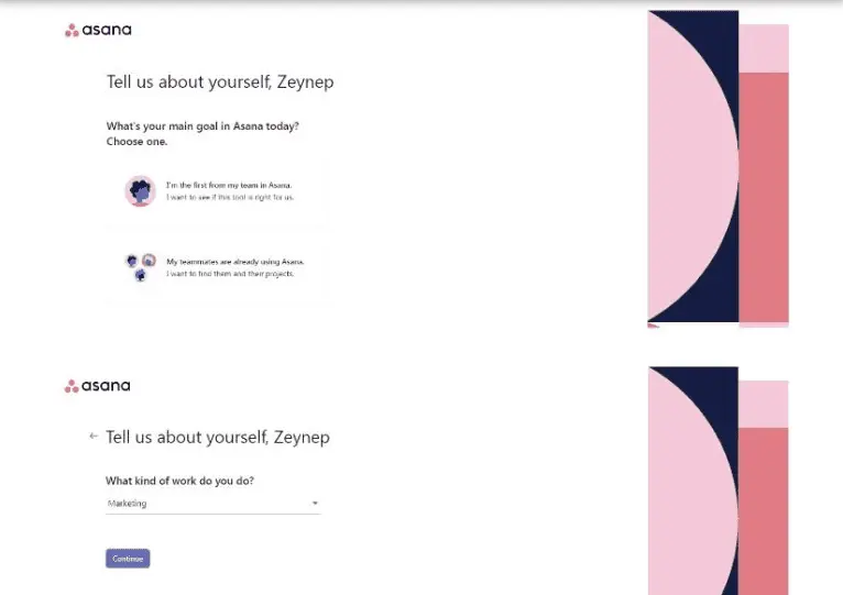
Asana’s team takes the end of the walkthrough a step further, giving users ideas for how they can enhance their projects and automate their tasks.
Adobe
Product walkthroughs can ease users into adjustments to your product. Adobe Premiere Pro, for example, deploys a product walkthrough whenever there is a new update to their software.
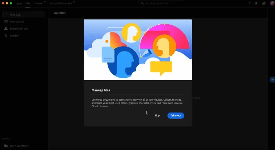
They show users what the modification or new feature is, where to find it, and how to use it effectively. Sharing this information as soon as changes happen gives Adobe an opportunity to connect with their users and help them weave them into their daily workflow, ultimately increasing adoption rates.
How to create product walkthroughs that convert
Step 1: Define goals and map user journeys
The first question you should start with is: What do users need to know?
Review your onboarding documentation or meet with your CS team and ask them what users should be learning and how they can gain value from your product.
If you don’t have a CS team yet, a good way to solidify this is to spin up a new test instance with fresh eyes. Write down what you think you should be learning as you go through the product for the first time.
Step 2: Choose the theme of your product walkthrough
Next, decide what your product walkthrough will show. Again, use your customer success team materials to your advantage.
Would it work best to show a high-level overview of product navigation? Or do you want to dive into a specific feature?
There are infinite ways you could use a product walkthrough, but it takes time to create and customize them. We recommend starting with just one theme and expanding from there.
Step 3: Create a high-level outline
Now you need to figure out what, exactly, will go into your walkthrough.
Write it out, step by step:
- When the walkthrough is going to launch. (For example: the first time someone logs into your product, the first time they use a specific feature, when a new feature goes live, etc.)
- What feature you’re bringing users’ attention to.
- What your tooltip will say.
- What your call to action is during or at the end of the walkthrough.
Once you’ve got a draft, share it with your team. Ask them to point out any parts that are confusing, seem out of order, or are too advanced for a new user to learn at this stage and make adjustments based on their feedback.
Step 4: Build your walkthrough
With your outline in hand, building your walkthrough should be relatively simple. Keep reading for a deep dive into walkthrough software you can use to speed up the process.
Where it makes sense, you may want to include links out to your help center, product videos, or other training materials. Be conscious of your copy as well — is it clear? Will users be able to replicate what you just showed on their own?
For copywriting suggestions, check out: High Converting Tips from a Copywriting Expert
Step 5: Personalize and segment experiences
Not all of your users bought your product for the same reason. If you know that a user works in a particular industry or will be more interested in one use case over the other, find a way to swap out the walkthroughs presented to them.
That likely means you’ll have to connect your product walkthrough platform to your CRM, so make sure that the tool you choose to work with has a native integration.
Step 6: Iterate on your walkthrough
Your walkthrough won’t be flawless the first time you publish it. Even if it is mostly all the way there, you can always improve on what you have.
Look into your walkthrough tools analytics and reports to see where people are opting or clicking out of your walkthrough. Is there a way you can get them to stay?
Go through the walkthrough yourself to determine what might be impacting people’s follow-through and make tweaks accordingly.
How to use product walkthroughs and interactive product tours together
Though product walkthroughs and interactive product tours often serve different purposes and show up in different places, they can be very complementary.
If activating free trialers depends on a complicated setup, for example, an interactive demo can convince them of the value of doing so — before you walk them through the process in your product.
And in a tool like Navattic, you can create supporting interactive product tours without needing to touch any code. Here’s how most of our customers use Navattic tours and product walkthroughs together:
They add product tours to email onboarding sequences
You likely already have an onboarding email sequence that reminds users that they have access to your free trial and highlights the features they might be interested in.
Adding an interactive demo to that flow can expose users to more of your product’s high-value features and get them to re-engage with the free trial.
Consider making multiple demos — one for each important feature. Add those to corresponding onboarding emails to increase the likelihood of activation.
They add an interactive demo as an exit intent pop up
The last thing you want is for users to bounce from your free trial. An exit pop up with an embedded interactive demo can keep users motivated to continue with setup and stay engaged in your tool.
Schedule an exit intent pop up to appear after a certain amount of inactivity so that you don’t lose disengaged free trialers forever.
They include demos in your product onboarding experience
Most Navattic customers use interactive demos to ease users into their products, educating them on features first — before they set anything up.
Julia Schlocker at neuroflash takes an extra strategic approach, creating interactive demos for the features that help most with retention and putting them front and center in onboarding materials.
“We determined what features help us in retention and make sure that users (free users especially) convert,” she says. “We build one flow for each of those features, and then we get the users in our app to click on it inside what we call a ‘learning center.’”
The best product walkthrough software
If you’re ready to get started, we put together a list of the top walkthrough builders we recommend. Keep reading for a deeper dive into their unique functionality and pricing.
Userguiding
UserGuiding helps you create and improve in-app experiences without having to code. Admins can track hotspots, add interactive manuals, and even send NPS surveys via their product walkthroughs.
Standout features
- Knowledge base: A hub for user enablement content within your app.
- Segmentation: Group users according to different attributes and create an onboarding experience just for them.
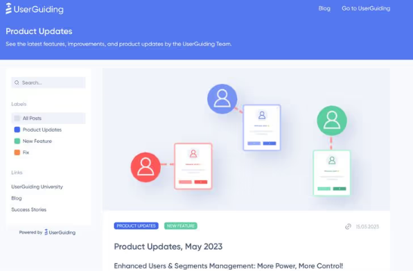
- Product Updates: A standalone product changelog where you can promote feature announcements through the resource center or a push notification and collect user feedback.
Pricing
UserGuiding has three plans:
- Basic: $69/mo, which gets you access to the fundamental feature set as well as email and chat support.
- Professional: $199/mo, which gets you unlimited guides, hotspots, checklists, white-labeling, and dedicated support.
- Corporate Plan: Negotiate with sales. This plan gets you fully customizable walkthroughs with CSS, coaching, and SSO.
Chameleon
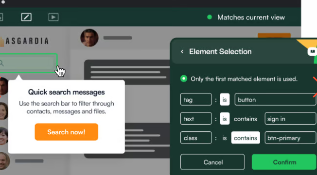
Chameleon is a product adoption platform that helps SaaS teams use real-time user data to improve onboarding and build on-brand, in-product experiences.
Standout features
- Navattic integration: After activating Navattic in Chameleon, admins simply copy and paste embed code into a Chameleon Experience. Then, free trialers or freemium users will have the option to “See Demo” before diving in, getting them acquainted with the tool before they follow other Chameleon onboarding steps.
- A/B testing: Admins can easily analyze their in-app experience data and iterate fast.
- CMD+K: Universal search where users can find relevant resources and get AI-summarized answers to their product questions.
Pricing
Chameleon has four pricing plans:
- HelpBar: $0/mo, which gets you CMD+K search inside your product, native fonts, Help Center integrations, and AI answers to user questions.
- Startup: $279/mo, which gets you HelpBar with targeting, unlimited tours & tooltips, 5 microsurveys, 1 launcher, and custom CSS.
- Growth: $1,500/mo, which gets you A/B Testing, rate limiting, unlimited goals tracking, and customer success.
- Enterprise: Negotiate with sales. This plan gets you unlimited seats, roles and permissions, localization, account switching, and contract redlining.
Appcues
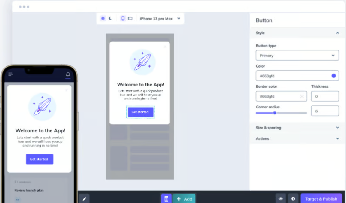
Appcues is a product walkthrough vendor that helps companies build personalized product experiences by installing an SDK or integrating with a CDP like Segment.
Standout features
- Insights: Admins can build sleek data visualizations to show feature usage and button clicks by user segments and identify areas for improvement across the user lifecycle.
- Page Targeting: Use the Appcues targeting engine to decide when and where users see a message (e.g., on a specific page or screen)
- Custom Goals: Track combinations of behaviors, such as trying new features and registering for a training session, to understand the impact of changes you make to your in-app experience.
Pricing
Appcues has three pricing plans:
- Essentials: $249/mo, which gets you 3 team members, flows, surveys, NPS, and persistent icons and buttons, 5 audience segments, 10 Track Events, and email support.
- Growth: $879/mo, which gets you 10 team members, checklists and resource center, unlimited audience segments, unlimited Track Events, unlimited integrations to 30+ tools, and customer success support.
- Enterprise: Negotiate with sales. This plan gets you unlimited team members, advanced security and SSO, roles and permissions, localization support, premium support and services, and access to activity logs for security auditing.
Get the best of both worlds — tie your product walkthroughs to interactive demos. Sign up for a free Navattic account today.