Buyer First Website Review: Riverside with Anna Furmanov

About this series: Buyer-First Website Review is a recorded version of our Buyer-First Bites Newsletter.
Each month a B2B expert will on-the-spot review a SaaS website against the best practices from our 2024 B2B Buyer First Best Practices Report:
- Accessible: How convenient is it for buyers to book time with a sales team
- Visible: How public is the pricing and packaging
- Usable: How easy is it for buyers to get hands-on and use the product
See below our advisor, Anna Furmanov’s first reactions to the website, Riverside.
Watch the full recording or see the highlights below:
Buyer First Bites: Riverside
For each bite, we've summarized that section and included the corresponding clip.
1. How simple is it to book a demo?
All the CTAs make it really easy to just jump in and start for free.
If I click on contact sales though it brings up a chatbot, with a pre-set option to “Inquire about Riverside’s plans and pricing”
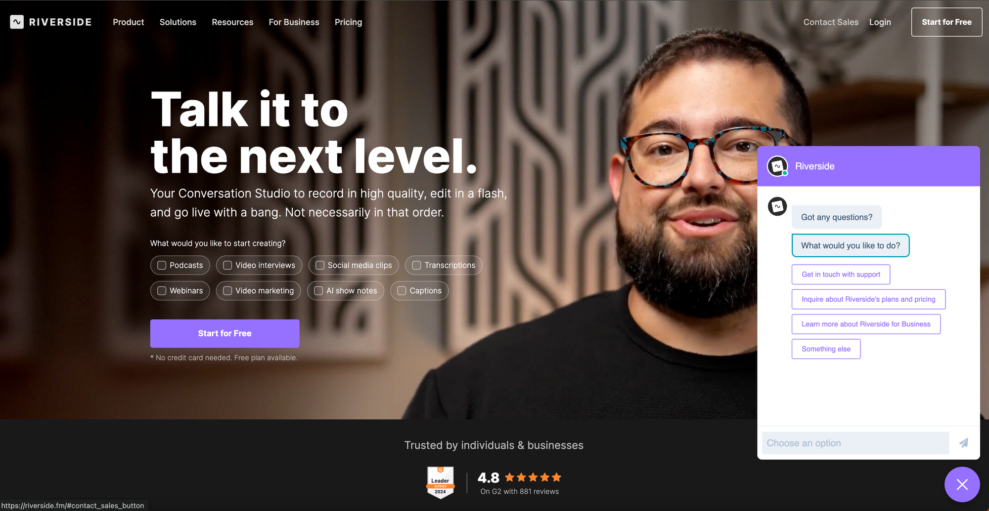
If I click on that it opens up their support docs and prompts me to reach out to their support to get information on pricing and plans.
I would say - if it says contact sales, I actually would love to have scheduled something with the sales team, but I think their focus is you should be able to sign up and use this.
Clip #1: Chatbot talk to sales experience
2. Can I see the product before signing up?
From the homepage, I can’t really figure out how this product works without jumping into the free plan.
As I scroll down, I see some product graphics and videos of people recording. It shows a graphic that the upload is complete, but I'm not actually able to try out uploading.
I see another image showing a recording with text but without jumping in and trying it out, it's hard for me to understand what the text in the image has to do with the image.
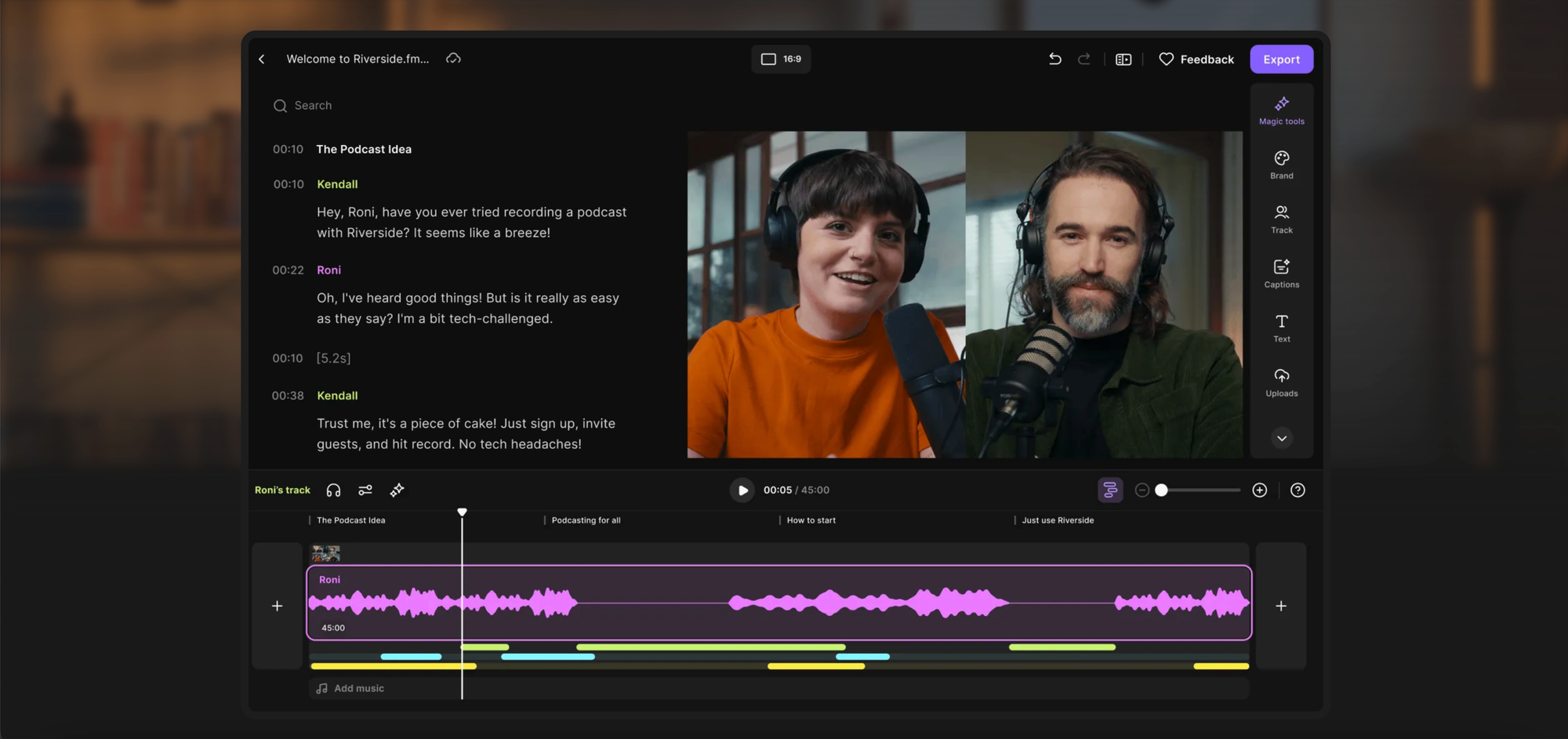
The get started call to action is everywhere, which makes it more likely that I'm going to get started.
So the one thing that I would recommend is that they have a way for me to play around with it without having to create an account because I might want to do that right before I create an account.
Clip #2: Get started vs trying the product
3. Do they show their pricing?
If I don’t want to start for free, they make it really easy to see what's included in a paid plan.
They call out their middle, pro as the most popular, this is where my eye goes first.
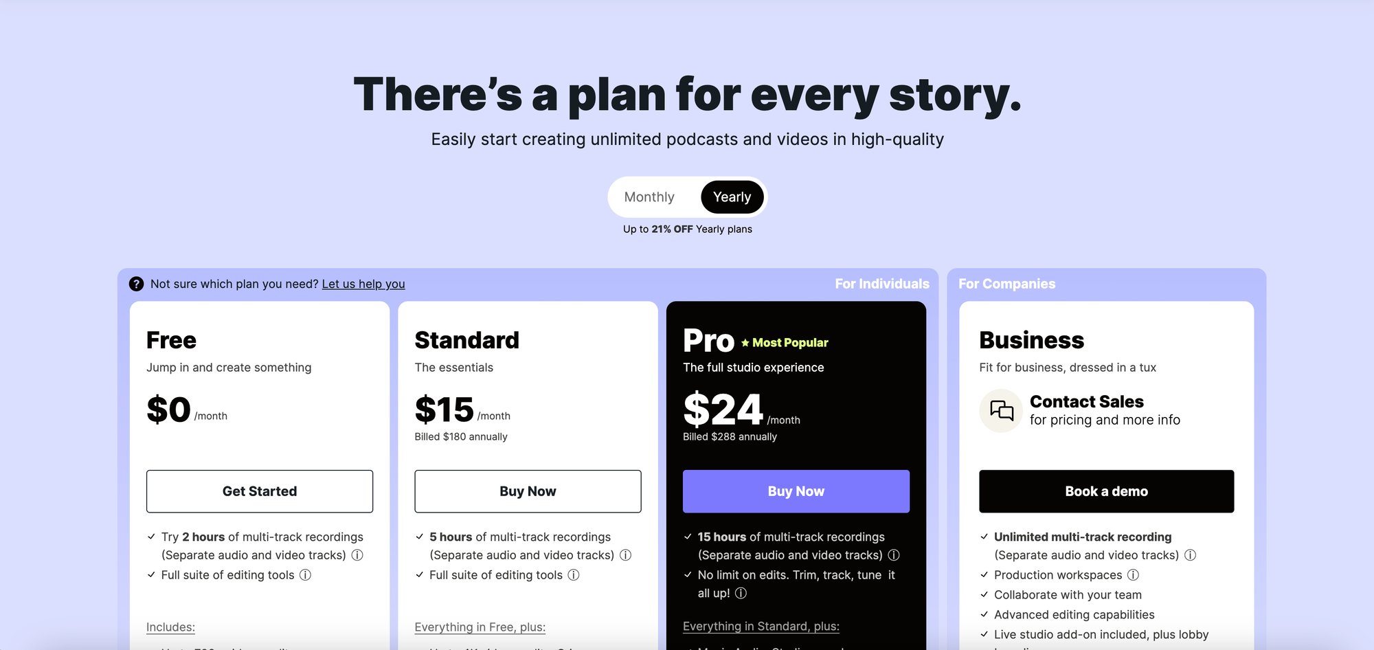
For companies, it also gives the option to contact sales. Clicking into "Book a demo" I don't love that I have to fill so many fields out. I would just narrow this down to just be, like, first name, last name, email, if possible.
Overall though, really easy to find the pricing.
Clip #3: Pricing page tiers
[Bonus Bite] Social Proof
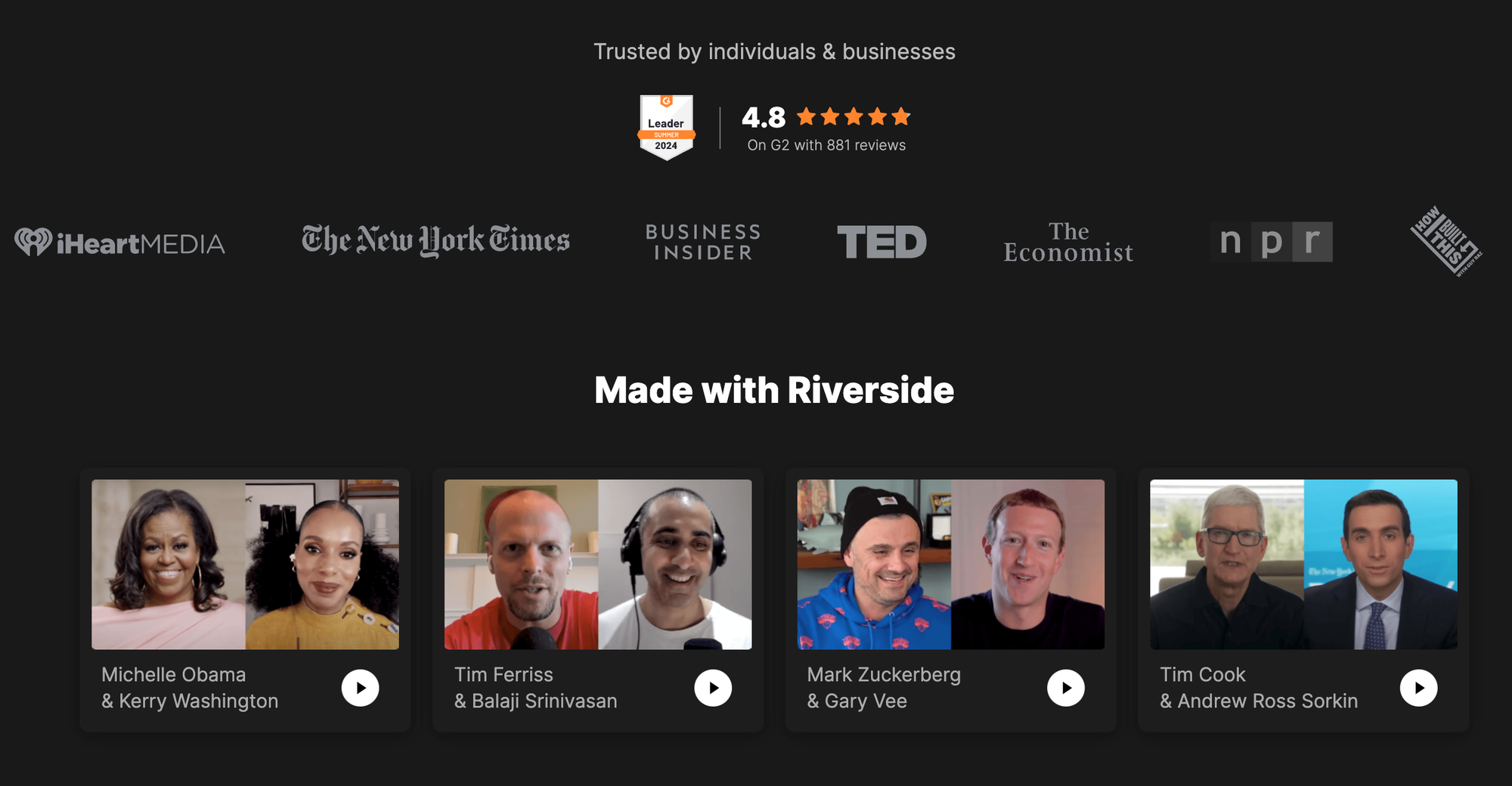
Right away they include amazing famous people who use Riverside like Gary Vaynerchuk, Mark Zuckerberg, and Michelle Obama.
They also have a callout for 4.8 starts on G2, so I'm really trusting this product already.
[Bonus Bite] Above The Fold Copy + Messaging
The cool thing about the Riverside homepage, it's just like really takes up the whole entire screen. I think it's really engaging to see people talking versus just, like, a snapshot of somebody.
It gets you to feel like you're already in the recording studio.
Their headline is “Talk (instead of take) it to the next level”.
I recommend for any stage startup: be really clear about who's it for, what are you building for them, and why is it different.
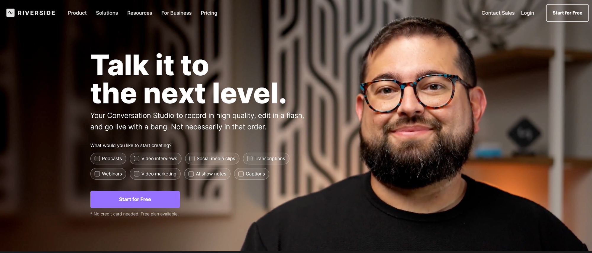
So there was a little bit about why it's different when I looked at the quality. Riverside quality versus other studios, but there's gotta be something else.
I want to know right away when I land on the home page in the top header banner, why would I care about looking further into Riverside versus other recording studio platforms?
And I don't know, with talk it to the next level, it's not really telling me too much about how it's different.
Turn demos into deals.
Build interactive product demos that engage buyers and close deals faster.