Step by Step Guide to Build Mobile-Friendly App Demos

More and more buyers are doing vendor research on the go.
Which means more and more buyers are viewing interactive demos on mobile.
An unoptimized demo makes for a not-so-great first impression. And for some buyers, that poor experience can kill a deal right then and there.
To make sure that doesn’t happen, Navattic offers several ways to build demos specifically for mobile viewers.
In this post, we walk through each option, share best practices for building mobile demos based on data we’ve collected from millions of demo sessions, and showcase real-life examples from 6 leading B2B SaaS companies.
Your Mobile Interactive Demo Options
Top SaaS companies have figured out that a good chunk of their website traffic comes from mobile.
In our State of the Interactive Product Demo report, over half (52%) of the top 1% of demos have an optimized mobile experience.
And they’re using Navattic to support it.
Navattic’s three mobile demo options automatically detect when someone is viewing a demo on a mobile device and display one of these mobile versions instead of the desktop experience:
Mobile Zoom
What it is: A full desktop demo with pinch-to-zoom and panning so users can get an up-close view of your product or feature on their smaller screens.
It’s a simple way to maintain your original layout while ensuring mobile visitors can comfortably explore your demo.
Best for: Demos where preserving the exact desktop layout matters. Think demos meant for training or sales leave-behinds. Also, if you are demoing a mobile app on mobile.
Mobile Swipe
What it is: A swipable demo experience built natively for mobile. Users swipe right to advance to the next screen.
Best for: Audiences where mobile is the primary viewing channel. For these prospects, a smooth, touch-friendly flow is the priority.
These also tend to work best for top of funnel demos because they’re meant to provide high-level overviews.
Mobile Alert
What it is: A custom fallback message, video, or image when a user views a demo on mobile.
Best for: Demos that are desktop-only by design. This message lets users know that your demo is not mobile-friendly.
Note: You aren’t limited to just one of these options. Different demos in your library can use different mobile modes depending on the context.
Not Sure Which to Use?
Here’s a quick guide to help you pick:
If your demo is complex and desktop layout is essential to see the product or feature’s value → Use Mobile Zoom
If mobile is a primary channel (e.g., you’ve got social campaigns and event QR codes) going → Use Mobile Swipe
If your demo doesn’t translate to mobile and you’d rather redirect to a different video or image → Use Mobile Alert
How to Set Up Each Mobile Demo Type
For Mobile Zoom
To create a mobile zoom demo, go to: Build > Mobile > select Mobile zoom.
Note: If you are demoing a mobile app, we recommend using mobile zoom. Per Jason Oakley at DemoDash: “I would create your interactive demo with real mobile screens so that when they look at it on a mobile device, it feels like they’re looking at the demo in the device it’s intended to be used on.”
For Mobile Swipe
To create one, go to:
- Build > Mobile > Mobile swipe demo > Edit Mobile Swipe Demo.
- Upload an Image or existing Capture to the Welcome step*.
- Add a title and description to introduce users to the experience and encourage them to swipe right.
- Click the [+ Add] button to add more steps. Each one will need an image, title, and description. Tip: Crop the images/Captures so they don’t appear too small in the preview.
- Add a Farewell step, with a button that takes them to the next step. Consider toggling on the CTA Button to give users the option to talk to sales or read your other content at any point during the demo.
- Scroll down to Advanced Options. Turn on Auto Progress to guide visitors through the demo by switching to the next screen every 4 seconds. Turn on Completion confetti for a little surprise when people hit the final step.
Jason emphasizes, “I like the idea of cropping, especially because it gets you to think about how you can just show the most important thing in that Capture. When you’re creating a mobile demo, that’s really key.”
To avoid dropoff, we recommend adding no more than 8 steps to your mobile swipe demo.
For Mobile Alerts
Navattic’s stock Mobile alert, “This demo has not been configured for mobile viewing yet. Please come back on a larger screen to experience this demo,” is turned on by default.
To adjust it, go to:
- Build > Mobile > Mobile alert.
- Toggle on Edit > Message.
- Add a title and description that instructs users to return on a larger screen.
- Optionally, you can upload your own image or GIF (select Custom Image) or a video (select Video).
Prefer to watch? Here’s a 9-minute walkthrough of each option:
Mobile Swipe Demo Examples
The transition to mobile demos can be tough if you’re only used to creating desktop-oriented content. That’s why we’ve compiled six excellent examples of mobile demos to give you a jumping-off point.
Note: You will only be able to see these mobile swipe demo examples on a mobile device.
HackerOne
HackerOne, attack resistance management software, uses a mobile demo to show how easy it is to run a pentest and track the results in their platform and in Slack.
Each of the seven steps has a mobile-optimized screen capture and short text to describe what the user is seeing and how it works.
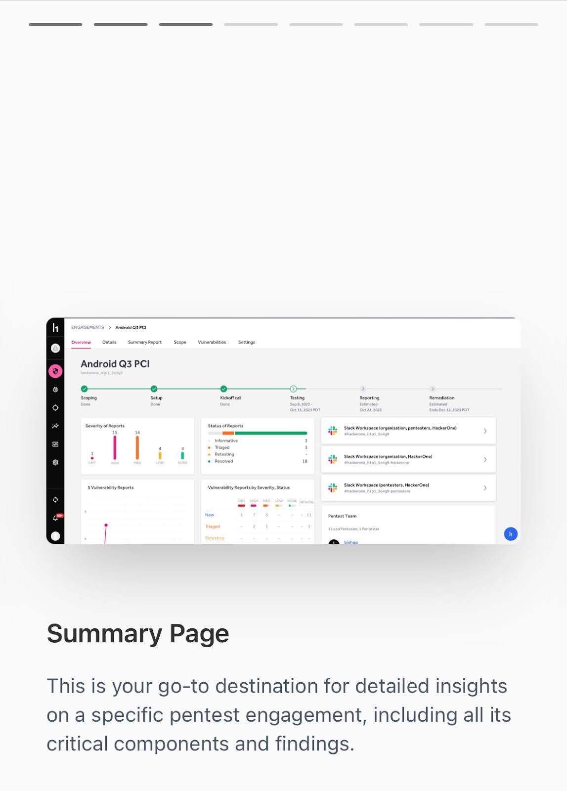
Just like other mobile apps, users can swipe right to advance to the next step. The user sees their progression at the top.
Quarter20
Quarter20, a CAD-connected wiki that automates hardware documentation, does a great job of explaining what their product does and how it works in a swipeable mobile demo.
That matters a lot for Quarter20’s user base: engineers working in the field.
And the team targets that audience very specifically with their copy, opening the demo with the line: “Less screenshotting, more engineering.”
It makes the value of Quarter20 clear right away, and then continues on to show how the software (1) pulls operation steps directly from CAD and (2) generates perfectly formatted documentation and instructions:

The demo closes with an invitation to book a demo – but not before sharing a convincing ROI stat: Quarter20 users cut documentation time by 80%.

If a user takes the leap and clicks “Book a demo today,” they go straight to a Calendly landing page where they can pick a time to meet with a rep as soon as the next day.
Hello Retail
Hello Retail, a personalization platform for ecommerce brands, goes into considerable detail in its mobile demo, running through three specific features.
The first is Search, which, as you can imagine, is really important for ecommerce brands. If a consumer can’t find what they are looking for, they’re probably not going to buy it.
The Hello Retail team shows prospects exactly how they can customize Search settings to ensure consumers land where they should – and they see other products they might like.

Next, they run through their “Retargeted Recommendations” feature, showing how to personalize the front-page experience for consumers while highlighting how easy it is to set up on the back-end.
Finally, they show users how to automate manual merchandising with Pages, an AI-powered tool to organize products into personalized categories for each customer.
Again, they explain why this feature is important, what it does, and how it works with real examples to hammer home the value.
At the end of the demo, visitors are invited to book a live demo with an expert.

But really, visitors can start the booking process at any time with Hello Retail’s perpetual “Book a demo” button at the bottom of the mobile demo screen.
ThoughtSpot
ThoughtSpot, an AI-powered analytics platform, plugs its free trial from the start of its mobile demo with a CTA button at the bottom of the page that remains throughout the demo.
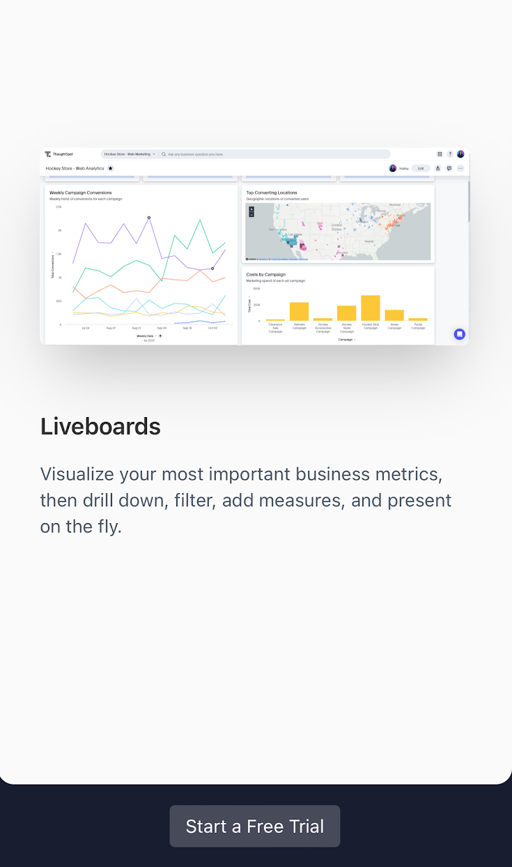
The demo takes users through a typical search workflow, from typing in a question to getting an answer to visualizing and detecting anomalies in company data.
At the end, prospects are prompted to sign up for a free trial, where they can explore the tool with sample data or connect their own.
Yokoy
Yokoy, AI-powered spend management, uses a mobile demo to showcase its Workflow Designer.
Each step shows users how to build separate processes for invoicing and expenses with company policies built in.
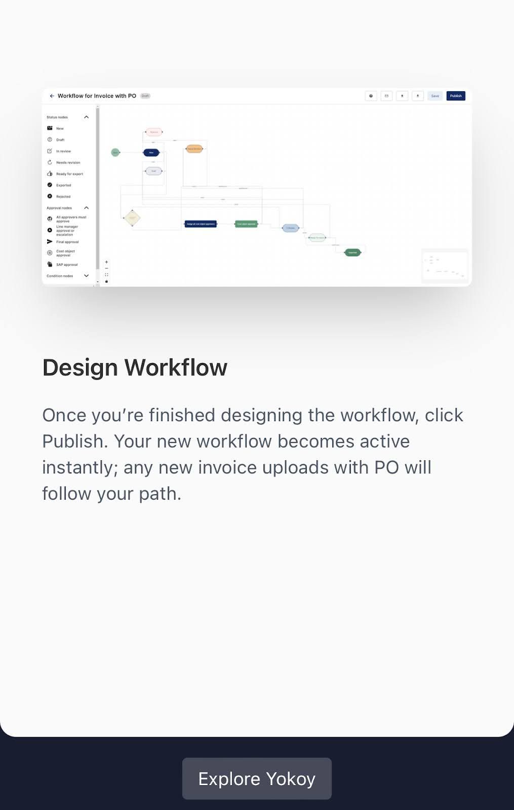
The Yokoy team also uses a perpetual CTA button to motivate users to explore more of the Yokoy platform.
CompanyCam
CompanyCam’s mobile demo is a fantastic example of less is more.
The CompanyCam app serves contractors who need help managing their projects while they’re out in the field.
Because they know their target prospects don’t have much time on their hands, the CompanyCam team limits step descriptions to just one sentence. They also show users their progression through the demo at the top of the screen.
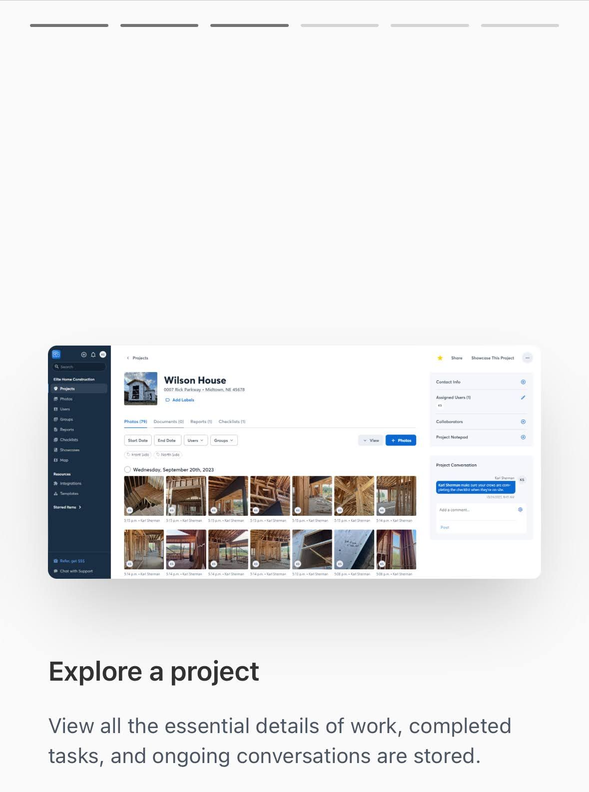
The demo concludes by driving users to a free trial sign-up.
4 Best Practices for Mobile Demo Design
In desktop demos, you have more freedom to add complexity and length. But on mobile devices, you don’t have that luxury.
Mobile demos need to be convenience-driven. That means:
- Reducing step count. People aren’t going to want to go through 20 steps of a demo on their phone. Keep your mobile demos short and use minimal copy that fits well on small screens. Per Jason, “I say cut your standard demo steps in half. If your desktop demo is 14 steps, your mobile demo should be about 7 steps.”
- Designing thumb-friendly CTAs. The whole point of a CTA is to get someone to click it, so don’t make your buttons so small that they can’t be clicked.
- Testing your demo. Make sure you’ve tried it on your own phone a few times. Chances are, you’ll find things aren’t placed quite where you’d like them to be, or there are opportunities to cut text down even more.
- Considering your audience. Where is your demo embedded? How likely is mobile traffic? Try putting it in a few different places to see what generates the most views.
Navattic gives teams the flexibility to handle mobile the right way for each demo.
Sign up to build your first mobile demo for free.
Turn demos into deals.
Build interactive product demos that engage buyers and close deals faster.